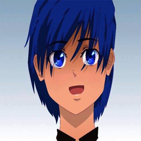
Very nice anime artwork, proportions are correct, stylish enough, maybe little bit too narrow face. I'd be for approving it if it had proper shading values.
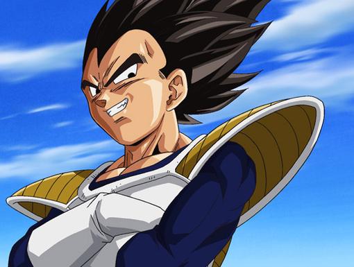
Take a look at Vegeta's face and the shading implemented. It's got backlight, shadows, transition, midtones and highlight. Your image has light source from above, but your shadows areas aren't articulated enough. And shadows are the way of dealing with flatness of 2D art. See how Vegeta's face appears 3D, now imagine how flat it would appear without proper shading. You should try to do the same with your image, nose in that case would look like a pyramid with one side shaded and so on. Gimp has a dodge/burn tool you can use to make it easier but remember that you'd probably have to adjust it at 50% cos 100% would cause too much of contrast.


 Approved


 thanks