• 🏆 Texturing Contest #33 is OPEN! Contestants must re-texture a SD unit model found in-game (Warcraft 3 Classic), recreating the unit into a peaceful NPC version. 🔗Click here to enter!
  • It's time for the first HD Modeling Contest of 2024. Join the theme discussion for Hive's HD Modeling Contest #6! Click here to post your idea!

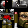
Zealot.blp

The Red Legion is a nation so devoted to the Light that they're often considered radical or even insane. So insane that Darkmoon Hero didn't just rip off the Scarlet Crusade.

This covers both the Crusader and the Zealot (axe-wielding and spear-wielding), a creep for the Red Legion in my AoS map that doesn't have a name yet. Helmet has only 1 minor edit, and the face isn't different, aside from the mustache, beard, and eyebrows, which were freehanded by me. I believe there's enough freehand to be accepted, though, and here's a link to back me up.
Not much else to say. The reason the the colors are so saturated on the kilt-thing is so it matches the red team color in game.

Constructive criticism is ALWAYS welcome. Flaming is not.

- - - - - - - - - -

You are free to download this skin and use it as you wish.

Editing or redistributing without my permission is FORBIDDEN.

- - - - - - - - - -

Update #1 : Added a belt and changed the shield to red. Added icon, as well.

Update #2 : Enlarged chainmail, updated screenshot.

Update #3 : Shinied up the armor, so it matches the chainmail better. Added straps to the shoulders and straightened team color stripe. Added a red emblem to the shield and blackened its border. Changed the weapon shaft and shield spike to red to fit the other changes. Added shaded space in the middle of the mustache. Added scratch shading to leather to look less like wood.

Updated #4 : Lightened the shield. Enlarged the emblem.

Keywords:
zealot, crusader, paladin, bandit, spear thrower, creep, the, red, legion, aeon of strife, AoS, Zodiac, darkmoon, hero, DH, noob, newb
Contents

Red Legion - Zealot (Texture)

Assets
Reviews
19:08, 19th Apr 2010 Dentothor: I'm sorry for this skins lack of recent review and moderation. But it is a well done skin and very good for a first try. Approved. :)

Moderator

M

Moderator

19:08, 19th Apr 2010
Dentothor: I'm sorry for this skins lack of recent review and moderation. But it is a well done skin and very good for a first try. Approved. :)
 
Level 13
Joined
Aug 8, 2009
Messages
886
actually its the first time i see u make a skin, didnt know u were this good

Thanks, though this isn't my first skin. I've made a few more, just never uploaded them because they sucked.

on topic, make the chainmail look bigger the details are very tiny and is not very visible in game, but other than that, its pretty awesome

Yeah, I noticed the chainmail was very fine, but I don't plan on changing it because it was a bitch to make. :hohum:

EDIT - Updated. I realized there was nothing holding up his kilt, so I added the belt. Changed the shield rim to red, because the gold color looked out of place. Also added icon.
 
Level 38
Joined
Jan 10, 2009
Messages
854
Chainmail looks a little to bright compared to the surrounding armor, looks almost chrome. I'd recommend making it a little duller, it doesn't quite fit in with the rest of the skin as is (it would be fine if he was covered in other shiny things though)

The shoulders could use some more work, they seem a little to plain, and the team color stripe on them seems a little crooked.

The red trim on the shield doesn't really fit, you might want to make the entire shield metal with a gray rim, you could change the shade of the gray boarder or just use some shading and highlights to make the transition apparent. You could also do something like the thorium armor upgrade for the orcs with his shield as well, that would probably work with the spike to. Maybe you could incorporate a red insignia in the middle of the shield, but it ust doesn't seem like the right kind of color to have on the edge.

The boots look like they are made of wood with the way the lines are going straight up and down them, cloth needs crooked lines, or larger wavy lines to look right (leather to).

Lastly, the mustache looks a little off, if you are going to have the hair go sideways make a part in the middle of the 'stache, or just make the hair go down instead.

can't think of anything else, for a first skin this isn't that bad. Bandit's wrap isn't that easy to work with either.
 
Level 13
Joined
Aug 8, 2009
Messages
886
Updated. Quite a few things were changed, so read the log. And yes, that is a symbol of a shield on the shield. A red shield is the Red Legion's symbol.

EDIT - Yeah, I know. The straps on the shoulders look odd because the shoulders' wrap is really wonky. They wrap perfectly on the portrait model, though, and that's where you'll be seeing them for the most part. And the reason I didn't change the axe head to red is because that part of the texture is also used on the back of his helmet.
 
Top