 Approved
- Joined
- Oct 2, 2011
- Messages
- 2,490

An extraordinary skin!
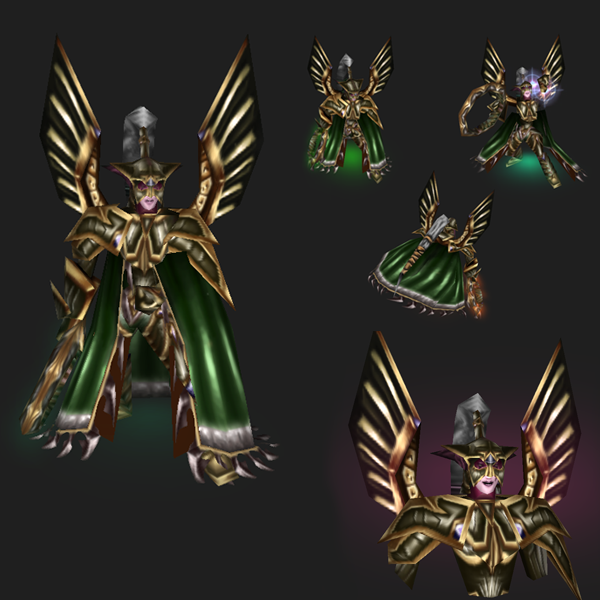
A complete remake of the original skin, which doesn't fail to capture the essence of the Warden.
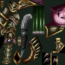
The only thing that I could think of improving, might be the golden lines on the "wings" beside the wardens head. Perhaps they could be a bit thinner to look less heavy.
TLDR: A masterpiece.
I'm so honoured that you wanted to help out with my project by contributing this!")
A complete remake of the original skin, which doesn't fail to capture the essence of the Warden.
-Shading on the cape makes it look twice as alive as on the original skin.
-The hair have been freed of its lumpy appearance, and a (teamcoloured) ribbon have been placed in it; now it makes sense that the hair is as well gathered as it is.
-In general more gilded trimmings, and a more realistic look, without getting too afar with the general warcraft art style.
-The hair have been freed of its lumpy appearance, and a (teamcoloured) ribbon have been placed in it; now it makes sense that the hair is as well gathered as it is.
-In general more gilded trimmings, and a more realistic look, without getting too afar with the general warcraft art style.
The only thing that I could think of improving, might be the golden lines on the "wings" beside the wardens head. Perhaps they could be a bit thinner to look less heavy.
TLDR: A masterpiece.
I'm so honoured that you wanted to help out with my project by contributing this!


