Listen to a special audio message from Bill Roper to the Hive Workshop community (Bill is a former Vice President of Blizzard Entertainment, Producer, Designer, Musician, Voice Actor) 🔗Click here to hear his message!
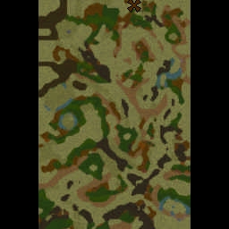
FROM THE UPCOMING CAMPAIGN: TO SEE A WORLD IN A GRAIN OF SAND Created by Xanur21
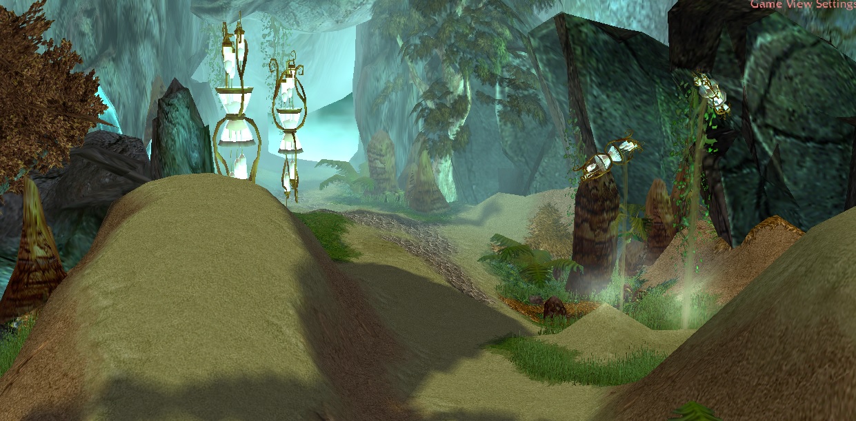
THE STORY BEHIND THE MAP
Deep under the Caverns of Time, exists a time-way to a world never thought possible. In an attempt to prolong his own life and avoid his mortality, Nozdormu hid the possibility of this world from the rest of Azeroth and its heroes.
With the aid of the Infinite Dragonflight, Jaina will infiltrate the deepest of caverns, in an attempt to right the wrongs committed against her, the Infinite Dragonflight, her loved ones and the rest of Azeroth, by the Lord of Time.
FEATURES
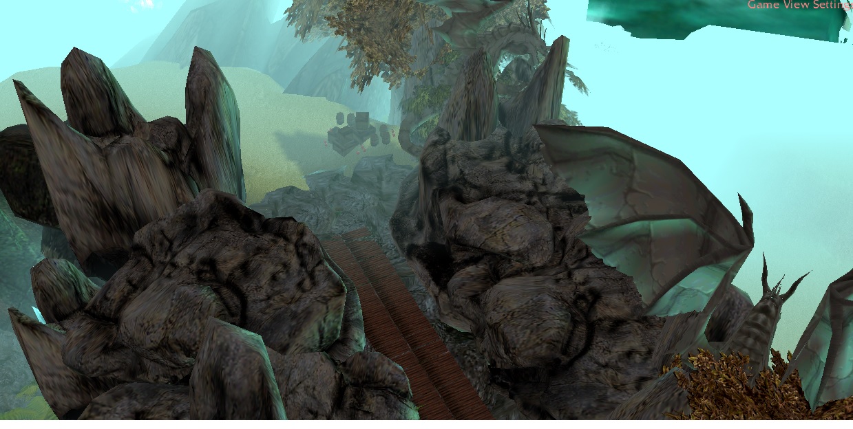
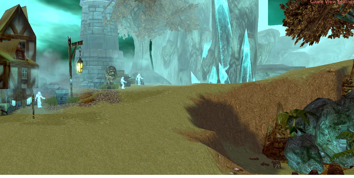
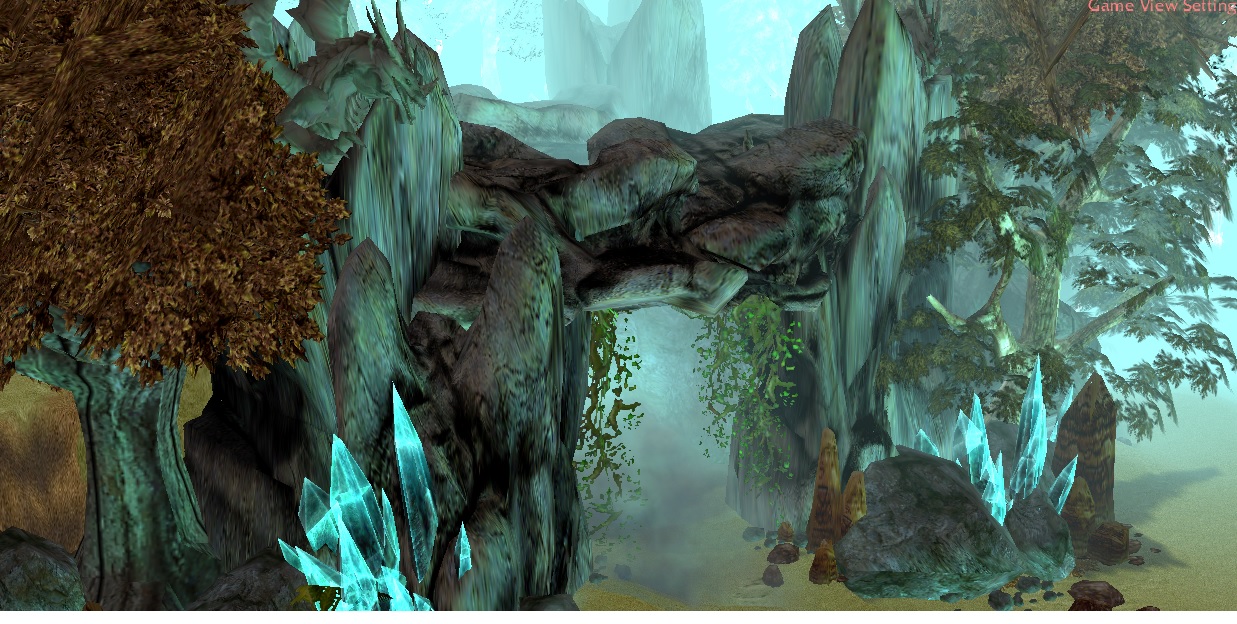
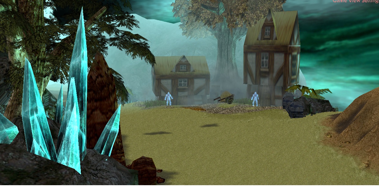
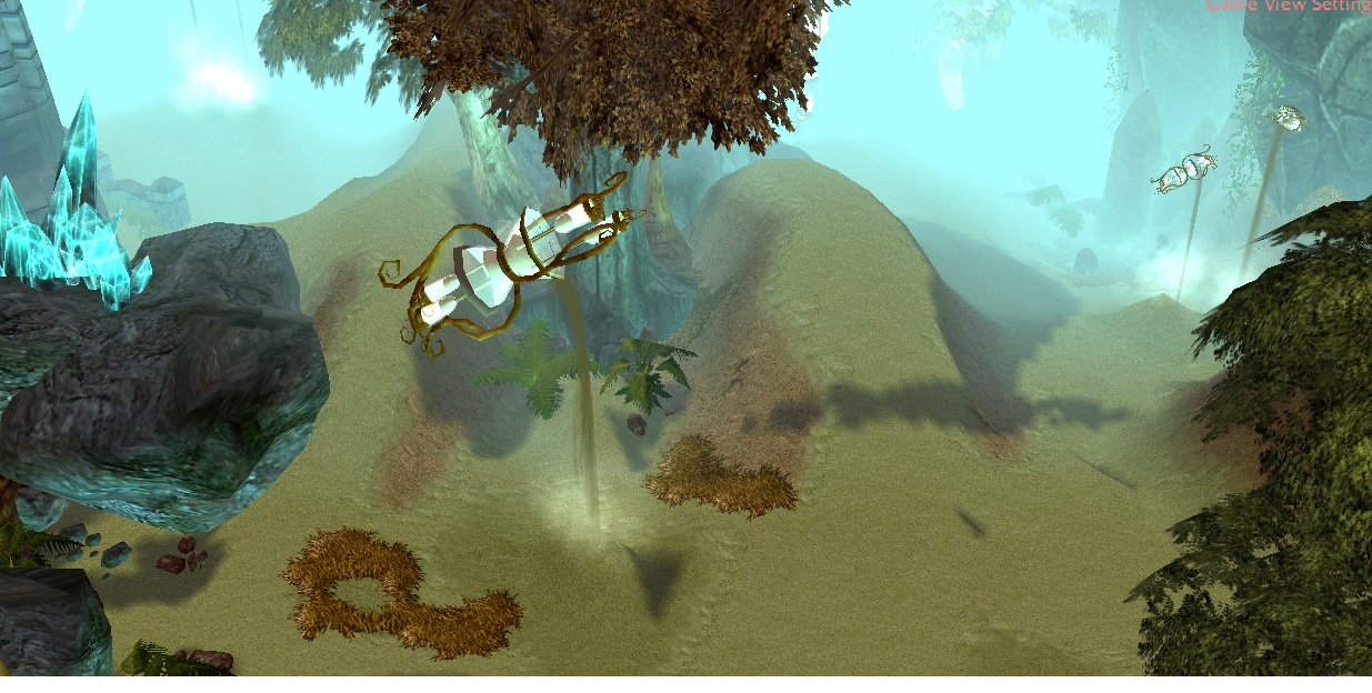
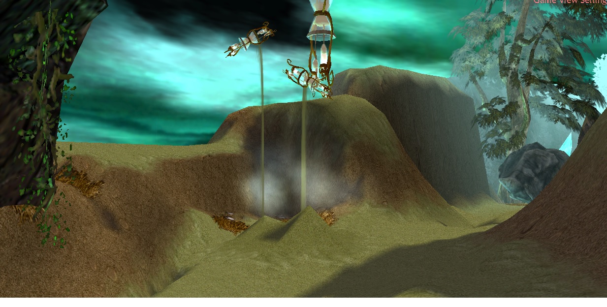
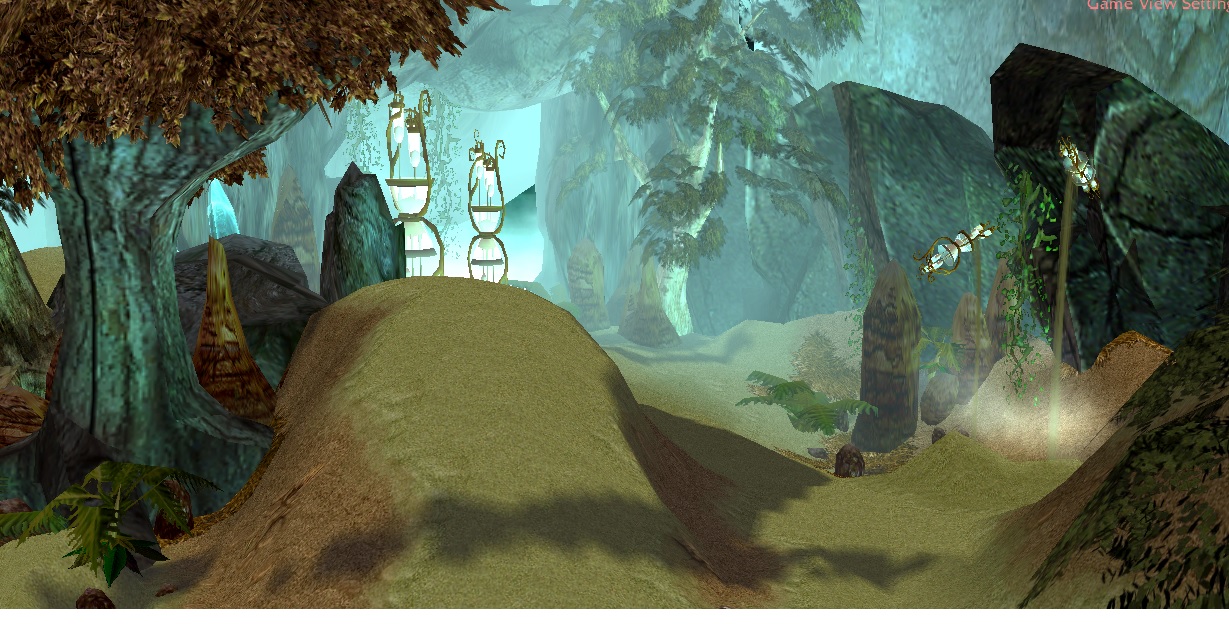
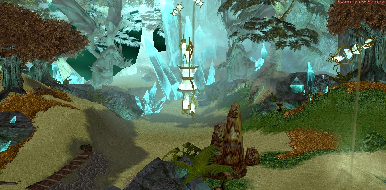
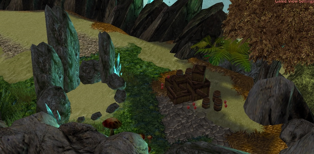
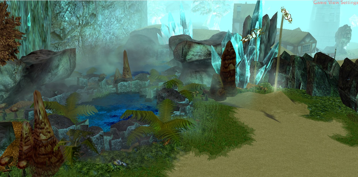
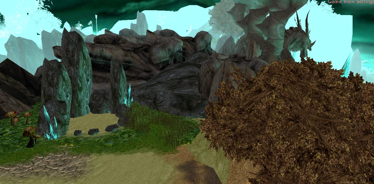
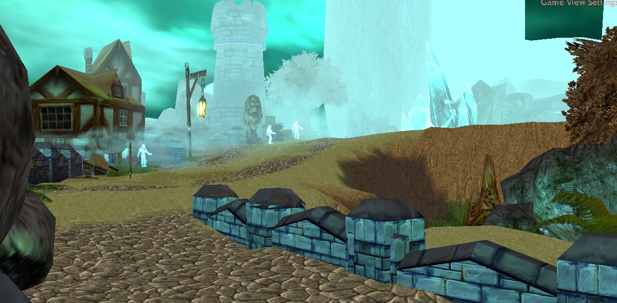
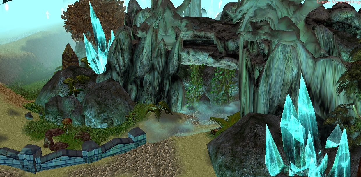
This map is situated within the deepest halls of the Caverns of Time. The aim of the map is to create the feeling of a distant, eerie, Infinite Dragonflight-inspired subterranean hallway, hidden from the sights of the mortal and immortal races of Azeroth for years since Arthas took up Frostmourne.
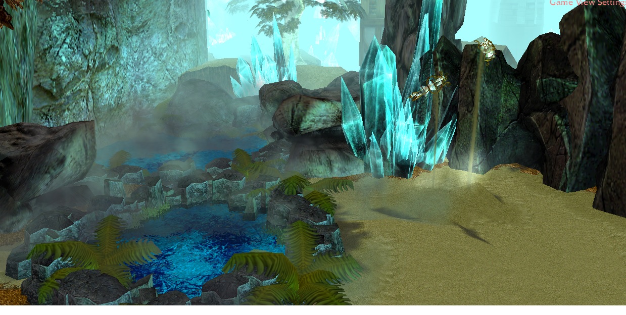
Come explore these hidden hallways, and discover hidden gems, from the icy Pools of Time, to the colossal Hourglasses of Fate.
DISCLAIMER
Feel free to use and edit this map, with credits to me and the creators of the used content in this map.
This map was made using The Ultimate Terraining Map 4.0, thus it is a big file. I did not attempt to remove any unwanted files, in the case that someone would like to edit this map.
= Reduced size of doodads
= Added 'Lumpy Grass' and 'Grassy Dirt' to Tileset
= Filled previously unused South-Eastern corner
= Replaced bridge with a set of Waygates
CREDITS
IF YOUR NAME SHOULD APPEAR ON THIS LIST, AND IT IS NOT, FEEL FREE TO CONTACT ME AND I WILL ADD IT.
If this is the terrain of a campaign you're creating, does that mean you're importing your files in the import manager instead of using the campaign importer?
Because you should really use the campaign importer instead of the normal importer if you're going to have multiple maps in your campaign.
Sorry about the lack of description and screenshots. I posted screenshots in the original 'preview' of the map in Map Development. I wanted to post screenies with the map upload itself, but I couldn't see an option to upload them with the map? Maybe I just overlooked it? I do apologise.
I'm a Junior Doctor, and I'm on call this week, so things are a bit hectic. I'll redo the description this weekend.
If this is the terrain of a campaign you're creating, does that mean you're importing your files in the import manager instead of using the campaign importer?
Because you should really use the campaign importer instead of the normal importer if you're going to have multiple maps in your campaign.
This is a terrain I'm going to use in my campaign. I uploaded the map as a terrain template, if anyone wanted to use it for something else, or improve on it for themselves, they're also welcome. It would also be welcomed if critique could be given on the map, i.e. any improvements, positive points, negative points etc.
As for my own campaign, I will have multiple maps. I will be sure to use the campaign importer. I've only created this map so far, and it is only the basic terrain. I don't have any custom units, scripts, triggers or cinematics yet.
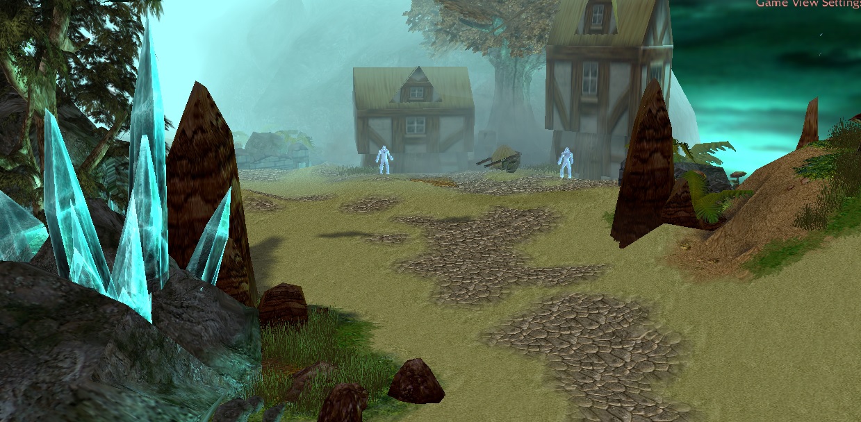
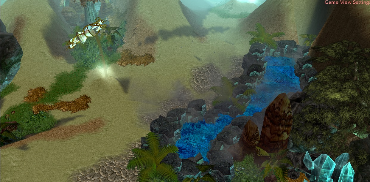
This is quite a nice template. The usage of doodads and the manipulation of special effects was simply magnificent. The way you used the mist and fog to give a creepy look to the entrance of the caves was definitely impressive; one couldn't ask for a better effect. The trick of the blue lava cracks altogether turned out to give a very pleasant magical aspect to the frozen ponds (were they even ponds?). You chose wisely the doodads to use for your template because in terms of doodads you did a very good job. However, when I saw the tiles, I was disappointed. They do not really seem to fit with the doodads. The contrast and difference in colours/tonalities is unattractive this the landscape doesn't seem to have any link with the environment. Tile variation is another point... you missed that. You've put sand and dirt everywhere; two tiles that look really similar. You could certainly be more creative on this part and add a greater variation of tiles.
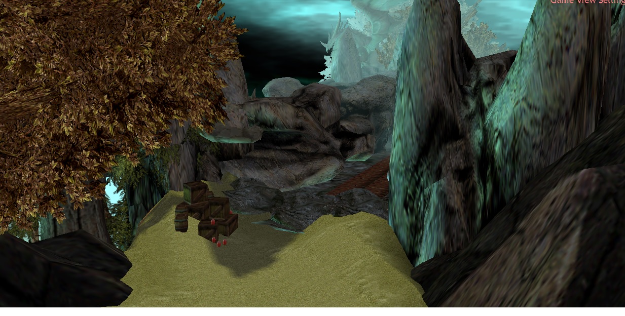
One of the most awkward issues is the enormousness of the doodads. They are so large that they obstruct the normal camera view, making it very hard utilizing this template for playable maps. You should reduce the size of those annoyingly gigantic doodads so that they have a more acceptable size.
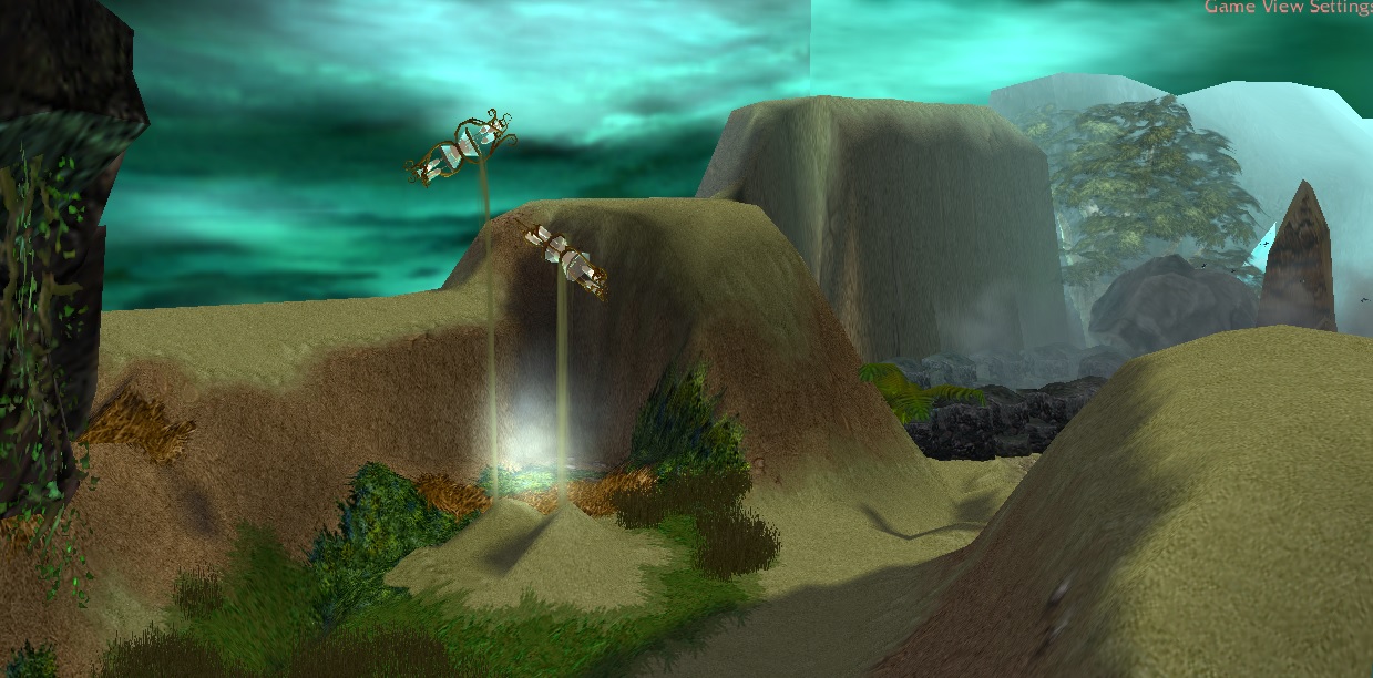
Finally, may I ask why the southeastern zone is totally empty? There's just a huge hourglass and nothing more. That's not what makes a template complete.
I would like to see some of those issues fixed before approving the template. For now, it's 3/5 but set to needs fix.
This is quite a nice template. The usage of doodads and the manipulation of special effects was simply magnificent. The way you used the mist and fog to give a creepy look to the entrance of the caves was definitely impressive; one couldn't ask for a better effect. The trick of the blue lava cracks altogether turned out to give a very pleasant magical aspect to the frozen ponds (were they even ponds?). You chose wisely the doodads to use for your template because in terms of doodads you did a very good job.
However, when I saw the tiles, I was disappointed. They do not really seem to fit with the doodads. The contrast and difference in colours/tonalities is unattractive this the landscape doesn't seem to have any link with the environment.
It is nice to receive feedback like this from you. I understand that for example the rocks are very contrasting to the sand. I will try and find a solution to this problem.
Tile variation is another point... you missed that. You've put sand and dirt everywhere; two tiles that look really similar. You could certainly be more creative on this part and add a greater variation of tiles.
I'm not sure how I feel about this. The Caverns are after all just tunnels in a desert. I feared that using other terrain textures would pull away from the Caverns of Time feeling, to just another subterranean cave somewhere else. I will try and implement different terrain textures for the sake of aesthetics and appeal.
One of the most awkward issues is the enormousness of the doodads. They are so large that they obstruct the normal camera view, making it very hard utilizing this template for playable maps. You should reduce the size of those annoyingly gigantic doodads so that they have a more acceptable size.
Finally, may I ask why the southeastern zone is totally empty? There's just a huge hourglass and nothing more. That's not what makes a template complete.
I originally left the area open in an attempt to create the idea of a never ending or continues hallway to the South-Eastern direction. The Hourglass was meant to serve as a centerpiece for a great battle that would take place there in the campaign, much like the large hourglass in WoW as you enter the Caverns of Time.
I shall close that area off and give it more 'fullness'.
Once again, I really appreciate your feedback, and I will get to work on those changes as soon as possible.
Wow, I've nearly forgotten this awesome template. Have you updated it? I received a notification saying so but I'd like to confirm before doing anything.
Wow, I've nearly forgotten this awesome template. Have you updated it? I received a notification saying so but I'd like to confirm before doing anything.
After the update, you are right, the 3/5 doesn't do justice to the template anymore, time for a change.
I must admit, I'm impressed. The special effects, the fog, the rocks... just everything is astonishing! Although overscaled doodads are still present, it's no more a concern. I tried going around the entire map with normal camera view and I didn't have plenty of problems of view obstruction.
I would give it a 5/5 but as Chaosy said, the ground lacks decoration and didn't receive enough awesomeness. I'm no expert terrainer so I leave it to you to figure out what could beautify it. Try experimenting with various doodads until you get something satisfying. Also try to do something for the awkward shadows. I don't know if you put them intentionally or not but they ruin the aspect of the terrain because some shadows don't seem to correspond to any object.
As for now, it is more than worthy of an approval with a rating of 4/5. Nicely done!
After the update, you are right, the 3/5 doesn't do justice to the template anymore, time for a change.
I must admit, I'm impressed. The special effects, the fog, the rocks... just everything is astonishing!
I would give it a 5/5 but as Chaosy said, the ground lacks decoration and didn't receive enough awesomeness. I'm no expert terrainer so I leave it to you to figure out what could beautify it. Try experimenting with various doodads until you get something satisfying.
I really appreciate the critique. I'm currently working on another project, but I'll revisit this map in the near future. It just didn't feel right at the time to throw down a few random tufts of grass and call it an "updated" map.
This site uses cookies to help personalise content, tailor your experience and to keep you logged in if you register.
By continuing to use this site, you are consenting to our use of cookies.

 Approved
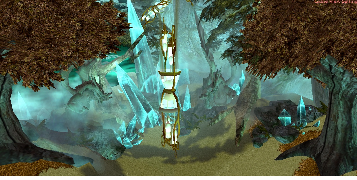

")


