Listen to a special audio message from Bill Roper to the Hive Workshop community (Bill is a former Vice President of Blizzard Entertainment, Producer, Designer, Musician, Voice Actor) 🔗Click here to hear his message!
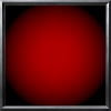
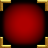
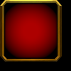
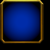
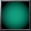
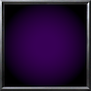
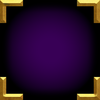
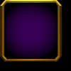
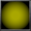
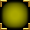
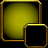
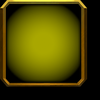
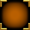
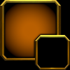
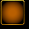
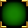
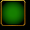
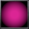
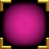
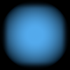
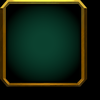
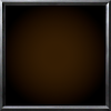
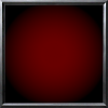
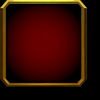
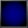
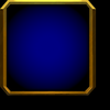
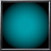
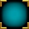
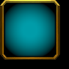
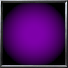
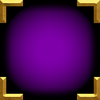
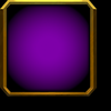
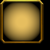
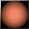
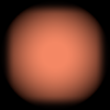
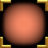
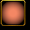
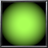
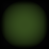
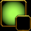
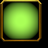
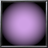
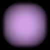
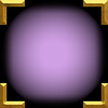
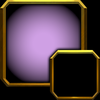
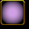
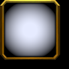
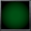
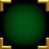
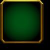
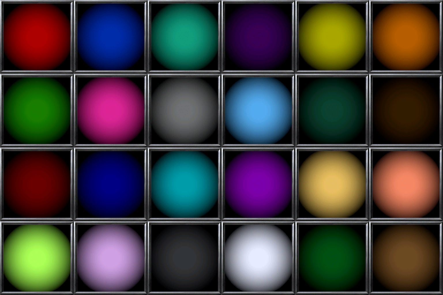
Great idea! I can see certain map makers needing/using this. BUT the colors need to be brighter. Right now they are too dim - especially in the center.
Great idea! I can see certain map makers needing/using this. BUT the colors need to be brighter. Right now they are too dim - especially in the center.
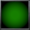
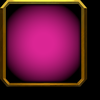
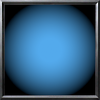
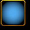
These icons were made with the precise color code as the team colors. I don't believe they have an issue with their brightness, but it's also probably the easiest icon to modify on this website.
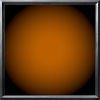
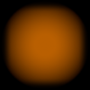
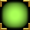
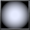
Here's an example of the first 10 colors in-game.
edit: well, to clarify, I kinda yeeted some colors in that screenshot as it was first-generation implementation, so the blue for instance does not match the uploaded blue here. All uploaded here are indeed color matching and were remade
This site uses cookies to help personalise content, tailor your experience and to keep you logged in if you register.
By continuing to use this site, you are consenting to our use of cookies.


")
 Approved


