I can understand that you're suspicious. Well, first of all, I will apologize for the UI's more disappointing areas. This is one of my first skins, and my first UI.
Unfortunately I tend to overwrite WIPs as I go along and feel satisfied with my work, even though I know it's a bad habit, but I'm not afraid of having to do some things over. It usually turns out better with each try.
But if it can help, I have a WIP of an unfinished UI, which I'm currently working on. Maybe it will help convincing.
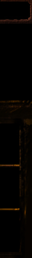
This is a layer only with raw shapes I need for the UI in progress:

These are like my geosets. I didn't use those in this UI: why I learned it.
And here the textures are made visible aswell:

For these textures I am using GIMPressionist filters from GIMP. In this one, I put textures into different layers, and used anti-delete to make the different layers visible in different areas.
The picture above has colorless textures. Here I have added colors and some shadows:

I treated colors the same way I treated the textures. In this one; 3 color layers with one clean color in each. Then erasing everything from the layer, to afterwards anti-erase gradually to merge with textures and mix colors.
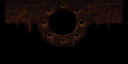
And finally you'll see the whole WIP as it looks:

See how the "geosets" came alive as I hit them with a super sledge, burnt them with a flamethrower, and spat acid on them.
Beneath everything I have a mask layer, so I can easilly repair anything that reveals the minimum-area where a black box appears ingame, by using "magic wand" selection.
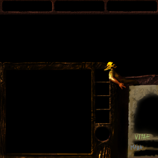
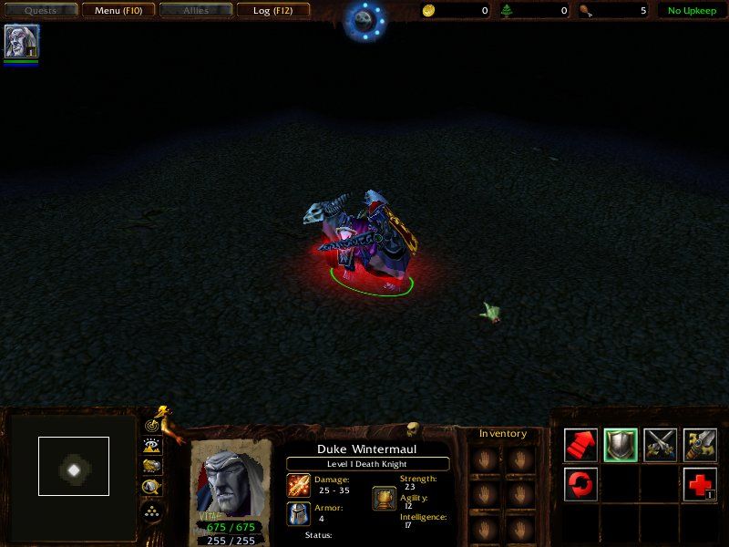
For the this finished UI I started with a cloth filter. I make plenty use of the burn/brighten tool to make texture, shadows, and other details, such as the little yellow goblin. The goblin came as I was making the upper-right corner of the minimap panel, and realized something which looked like a head, so I increased the facial tendencies and head shape, added a body and arms, then ears. I make these extensions such as limbs by using smudge, (or whatever it's called in English (the finger-cursor)).
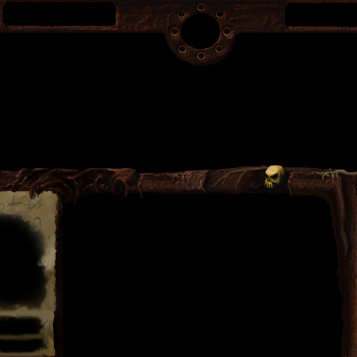
The viny-tentacly things were made by smudging a long sausage, then to burn the edges as necessary (mildly on the side of light and heavilly on the shaded side), and then brightening the center for weak highlights. That tool also serves as a way to camouflage that smudging was used; it is good for making tiny realistic bumps/depressions/textures.
I think you are mistaking my crazy style-mixing for pure randomness. I tend to experiment a lot as I work, and I need time and distance from it before I can judge whether something is overdone/overestimated. I'm terrible that way.
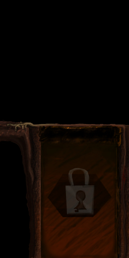
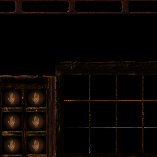
What I attempted was to give it a cartoony feel. I think the padlock on the inventory cover, the hands in the inventory, and the holed paper sheet portray this attempt. And when I realized the paper sheet seemed holed or lousilly fake-holed rather than fading (as was the real intention) when seen in-game, I didn't bother to improve that. I apologize for that. I couldn't use the alpha-channel the way that I had hoped. Otherwise it would seem more like the portrait was part of the paper, becoming real in the middle and being partially paper in the borders.
I'll see to updating it (changing portrait entirely, maybe getting rid of all cartoon attempts), but I'm in no hurry right now, since it has not even met a moderator's eyes yet, and I have my focus another UI at the moment. I'll do it as soon as I'm done with this current UI. Thanks for the feedback.
Edit:
So I've started adding some dynamics around the minimap now - this is what it's all about:

 Approved