Listen to a special audio message from Bill Roper to the Hive Workshop community (Bill is a former Vice President of Blizzard Entertainment, Producer, Designer, Musician, Voice Actor) 🔗Click here to hear his message!
This is a rpg template for people who don't want to waste too much time in making terrain on their own. At the top of the map I already made some dungeons. There is enough space for you to make the already existing dungeon bigger/smaller. Furthermore I didn't want to use more doodads than the map editor allows, so every one of you is able to decide whether you want more doodads than allowed or not.
Credits:
- Everyone in the comments
--> Especially StoPCampinGn00b
Features:
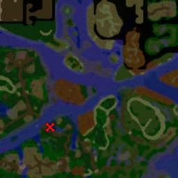
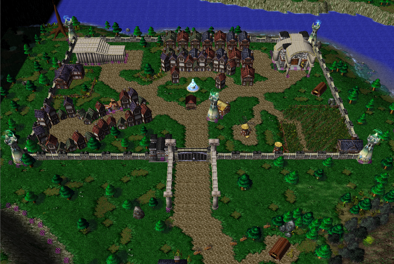
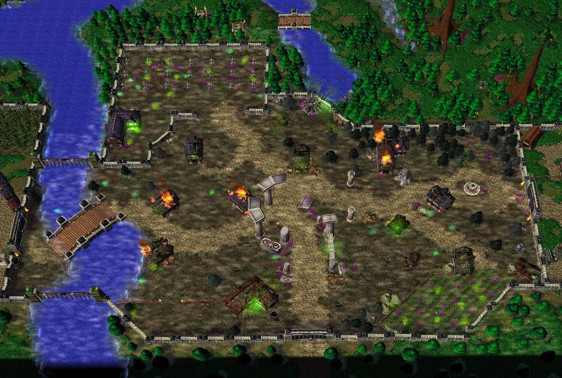
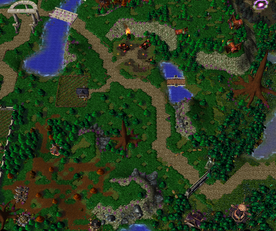
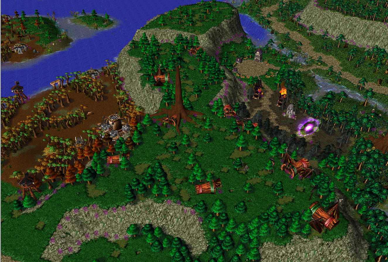
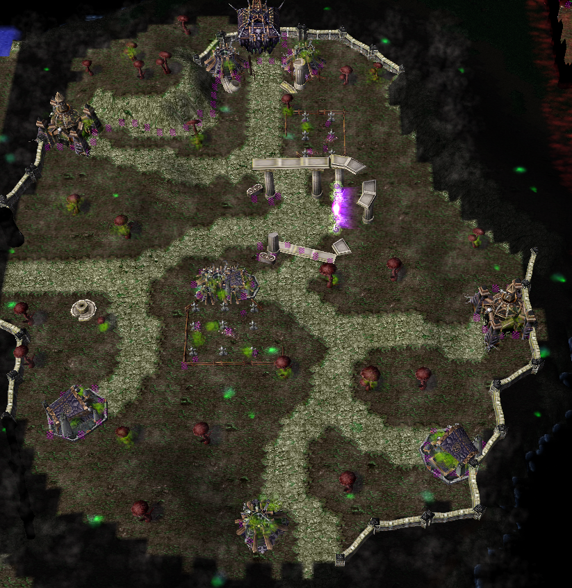
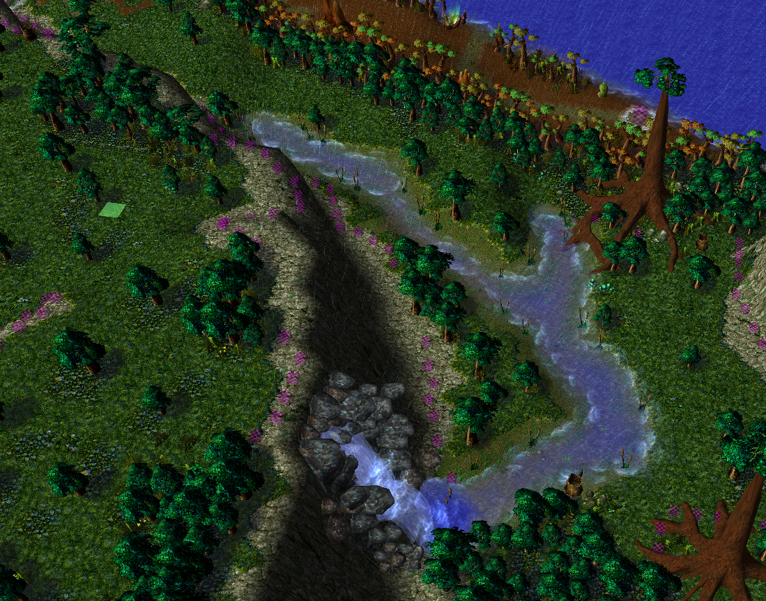
On the map you can find villages, undead villages, castles, forests, ashenvale forests, deserted spots, different dungeons. There is a river seperating different parts of the map.
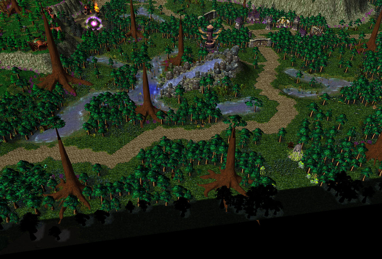
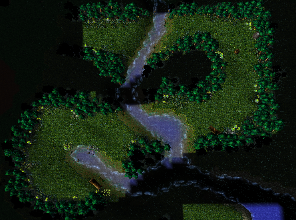
Screenshots:
Change Log:
Uploaded
- Added a new tile
- Removed a few big groups of trees
- Improved the terrain
- Removed a lot of the dark space
--> More Playable space
20:24, 14th Nov 2015
StoPCampinGn00b: Map improved, map approved :)
Overall the map isn't lacking but average now. Top left is on the scarce side and the top of plateaus can definitely be decorate more. What looks a lot better now are the height...
20:24, 14th Nov 2015 StoPCampinGn00b: Map improved, map approved
Overall the map isn't lacking but average now. Top left is on the scarce side and the top of plateaus can definitely be decorate more. What looks a lot better now are the height level usage and dungeons, but the whole of the map is also decorated more.
Thanks for the reply I'll try to bring some variation in the game and improve the terrain! Yes I don't use custom models because I think that it looks a little bit more natural without them. But if I find a interesting custom model i might import it.
You used a good tile variation overall and the map offers different kinds of areas.
Some areas, like the southern forest, could make use of some more little doodads.
The doodads count is quite high for what you present.
The black area at the top of the map is a bit big, you could arrange the place there more efficiently.
You added some nice areas and custom doodads.
This template could be useful for users wanting to create a RPG map or a Defence/Survival one.
You miss credits for the custom resources you used.
Review Result
You did a good job with this map, Alucard 1944, even though some themes repeat themselves you can make great use of all areas of the map.
It is simple, but useful.
Try to arrange the black mass at the top in a different way, allowing to create some more little areas there.
Please add credits to your map description thread and add yourself as creator in the map properties.
I vote for Approval with a rating of 3/5 Usefulafter you took care of the things I wrote the lines above.
Compared to the other templates uploaded in 2014 and '15, this is lacking. While it is useful for novice map makers that don't care about maps aesthetically, the map terrain wise is simply below average and significantly below average for templates.
The main issue you have going on is the spaces with repeated methods of filling it up. Large forests almost just consist of Lordaeron trees and a couple of shrub and rock like doodads. Cities or creep areas are the somewhat same way, lots of space and repeating basic doodads filling it up to a lesser extent. Basically doodad count is very low for a 256x256 map and the ones that are use are on the blander side. The tile usage is acceptable but it doesn't blend since you "polka-dotted" the grass with grassy dirt.
The plateaus waste a ton of space and look strange. What you can do is use miscdata.txt (play around with it first). miscdata can be found in the link below.
That's a nice update and big improvement, also a big update and nice improvement ^^
The map looks much more realistic shape wise with the cliffs and coastlines fixed. It'd definitely more decorative all around.
I think that the map is almost there. Compare the area of screenshot 6 compared to the area just to the left of it. The main difference is that you made the section in screenshot 6 not a strictly one themed section. (6) has winding paths, small rivers, a waterfall, and higher variety of doodads. It's okay to have a section be more wide open, but that isn't something to stray away from better decoration. Simply use similar techniques you used for (6) that match with that section and I think you'll get a good result. Now if you do this with most or even all other sections then you'll get a great result.
Also, there is still some negligence on the dungeon areas up top. There's awkward place from the second dungeon from the left that pokes into the regular zone while there is so much space above it. If you move it up, it wouldn't poke out. The undead one seems uninspired and still very empty. Maybe try to add an actual undead / dungeon themed boundary to it and fill it up more.
All in all, you don't have to do too much for approval. You can always of course strive for more.
I'll keep this as pending - notify me when you update it.
I also attached one of my abandoned maps that has RPG terrain on it. I'm not suggesting you to copy, just to look at examples if you please. You can go all out or just take some ideas. And note that it's not up for editing without permission.
Overall the map isn't lacking but average now. Top left is on the scarce side and the top of plateaus can definitely be decorate more. What looks a lot better now are the height level usage and dungeons, but the whole of the map is also decorated more.
This site uses cookies to help personalise content, tailor your experience and to keep you logged in if you register.
By continuing to use this site, you are consenting to our use of cookies.
 Approved
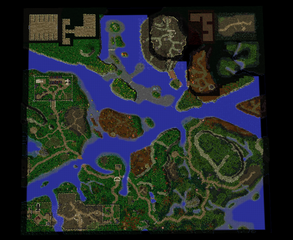
")


