• Listen to a special audio message from Bill Roper to the Hive Workshop community (Bill is a former Vice President of Blizzard Entertainment, Producer, Designer, Musician, Voice Actor) 🔗Click here to hear his message!
  • Read Evilhog's interview with Gregory Alper, the original composer of the music for WarCraft: Orcs & Humans 🔗Click here to read the full interview.

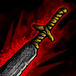
Red Guillotine

An unusually long and heavy machete used in the Red Hall of Cages for executions. Its weighted blunt tip, broad blade and single-beveled edge are designed for severing cervical vertebrae with a single downward cleave; hence it is wielded as an axe rather than a sword.
Referenced on this.
It's an experimenting stuff but I hope it's good enough for approval.

ucAnPqa.jpg

Credits to Ska Studios and me(?)
Update: 12 July - Cleaned up the bg effect, kind of.
Contents

Red Guillotine (Icon)

Level 66
Joined
Jun 2, 2008
Messages
11,645
The blade itself doesn't seem very sharp, add more bright white towards the edge of the blade giving off sharpness. The red effect around the blade is nice, but since its a guillotine, it would be nice too have an effect that shows the blade being swung downward towards an enemy. And, maybe instead of the effect being red color make it a different color and add blood coming off the blade in places.
 
  • Like
Reactions: San
Level 50
Joined
Mar 22, 2016
Messages
588
I think I told someone here before, it is always a good idea to take a look at image you are working on for longer time from different angle, for instance flipping the image horizontally, you'll spot the flaws easier. I like the angle, but you should make some improvements to the metal.

Pure black should not be present in larger areas of coloring in foreground objects, it should be reserved for backgrounds. There is no need for high contrast in foreground unless you want to emphasize something specifically, here is no need for that as object hasn't got effects, it is a single object illustration and it needs balance in all its parts. Try to tone down the darkest parts so that the difference between brightest and darkest point are in closer range, like these two examples:

upload_2017-7-10_13-49-24.png
upload_2017-7-10_13-49-33.png


upload_2017-7-10_14-4-54.png
-this is one of the most defined icons in wc3 and probably one of the best to present ''wc3 feel'', it is very clear and ordered, uses very low contrast and technical aspects are subtle: colors, shading, outlines. Take a look at the outlines, they aren't black, they are just darker shade of main color used and they aren't thick, they are thickest and darkest in certain areas to emphasize the style or where it was needed to define the hand. It would be very good for getting wc3 feel to apply the same outline method to your icon (the naga thing above works the same, but it isn't very defined, outlines got smudged in icon size).
 

San

San

Level 32
Joined
Sep 23, 2012
Messages
1,307
Thanks for the very detailed reply!
I have spent hell lot of time on this but it's still not how I want it to look like.
Please set this to Awaiting Update, it will take ages before I can draw a proper stuff.
 
Last edited:
Top