• Listen to a special audio message from Bill Roper to the Hive Workshop community (Bill is a former Vice President of Blizzard Entertainment, Producer, Designer, Musician, Voice Actor) 🔗Click here to hear his message!
  • Read Evilhog's interview with Gregory Alper, the original composer of the music for WarCraft: Orcs & Humans 🔗Click here to read the full interview.

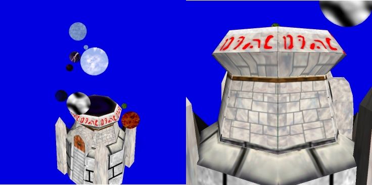
PwrPalace.BLP

This bundle is marked as useful / simple. Simplicity is bliss, low effort and/or may contain minor bugs.
  • Like
Reactions: deepstrasz
i used some paterns from gimp LUCK(im refering to the pillar with bat on top design in the wall<look close>)

Keywords:
Elements, palace, marble, magic, power
Contents

Elemental Temple (Texture)

Reviews
20:59, 18th Dec 2008 Dan van Ohllus: The lack of freehand in this skin is enough to make me reject this skin.

Moderator

M

Moderator

20:59, 18th Dec 2008
Dan van Ohllus:
The lack of freehand in this skin is enough to make me reject this skin.
 
Level 9
Joined
Sep 13, 2008
Messages
249
both comments-
1. its white to seem like a place of calm and clean power(purity)
2. unlike Misha, i have a life, so im not going to sit around all day doing a marble pattern that will end up looking crappy. :) happy time :)

well if you make your skins puplic you must handle criticism.
people here are fair and say what they dont like... it isnt a flame against your person it should be just a hint or an idea to improve your skin.
next thing is, you puplished your skin on a freehandskinpage.

in my opinion this skin is a good idea and i like the element stuff really much but i dont like that bricks and wall of the building. on the top part they are very smal and at the bottom toooooo big. the gaps could be more alternative not only straight lines. the door looks quite good at the top part but i dont get that you change sthe style into this white shutter.
all in all its as i said the idea is great. but the walls and the door could need some changes and details. if you paint this stuff freehand it would look much better then with straight lines. some shadings and highlights would be nice too
for the elements which are quite blurry use the sharpning tool and they will get better.

feel free to flame me like misha but then you are false here on this page...
we just want help
 
Top