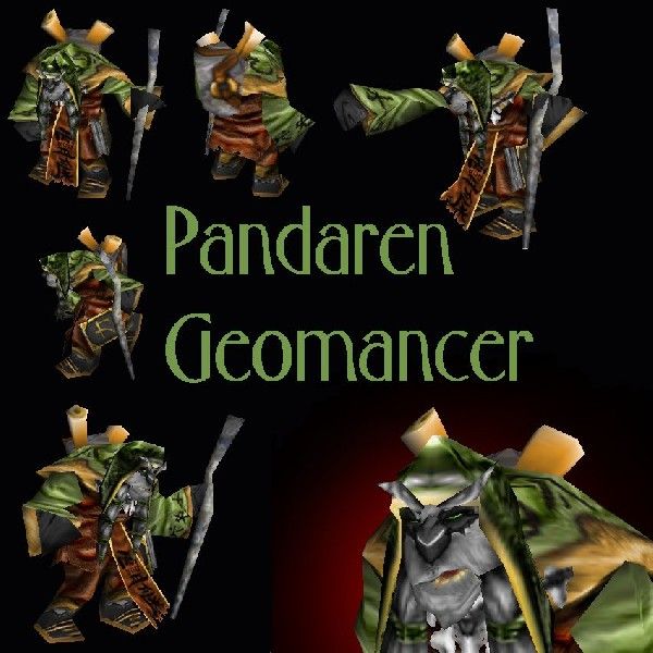
wow. talk about varied comments.
Lets see if i can deal with this. *rolls up sleeves*
"but it don't even close of looking like an Pandarien..."
Because it dosnt have the axact same head as the pandaren models that are spewing out in the model section? pandarens can have different facial strucutres, as specially as war3 is a veyr cartoony game.
"If this is your "half-ass'd" version, take it down and do it right."-no. ill put up what i like. This is easily good enough for the section, i dont have the time, patience or interest to redo this skin. its finished. Yes it could be better. but thats just how skins are. some are better than others.
"The face is just plain horrid.
you didnt even attempt to shade you simply recolored , added crappy symbols that you probably do not understand"- How is the face horrid. decent C&C wont actually help in this case as Im not redoing it, but i suppose it could help in my later skins. the "crappy" symbols on his cloak do mean something, and theyre the only CnP on the skin. I cant remember exactly what they meant now, but i think they may have had some slight relevence. The other symbols on his bosy n sleeves are freehand. I did attempt to shade, but i couldnt be arsed. there are teeny bits of shading in the skin.
"Bad model choise"-Your a bad choice....

Sorry, i just get sick of using the brewmasters head repeatedly.
"There is nothing you could to it."..well shucks...thanks..i think there is though
"i think its a CnP tome" Nah, tome is freehand. a bit recoloured from, then edited.
"Not a great skin actually... but WONDERFUL idea and use of model."- I would say thats the fairest comment here.
"Nose is a bit too big, like I says, and the line is too white, like I says..." True, the white line is too white.

but things are different sizes on the unrap. The nose is about the same size as the warlocks nose if i remember right.
 Approved

