• 🏆 Texturing Contest #33 is OPEN! Contestants must re-texture a SD unit model found in-game (Warcraft 3 Classic), recreating the unit into a peaceful NPC version. 🔗Click here to enter!
  • 🏆 Hive's 6th HD Modeling Contest: Mechanical is now open! Design and model a mechanical creature, mechanized animal, a futuristic robotic being, or anything else your imagination can tinker with! 📅 Submissions close on June 30, 2024. Don't miss this opportunity to let your creativity shine! Enter now and show us your mechanical masterpiece! 🔗 Click here to enter!

In need of help with cartoonishism.

Status
Not open for further replies.
Level 25
Joined
Mar 23, 2008
Messages
1,813
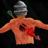
So well, I got this idea of an icon and I began working on it. Though I decided to scrap it after a while.
Reasons for this is: 1. It didn't turn out as good as I wanted. 2. It looked like crap. 3. It looked very cartoonish.
Though the problem here is now, that I can't seem to figure out what it is that makes it look so overly cartoonish, can someone help me with pointing out what it is that makes it so cartoonish?

Thanks.

(and nevermind any issues with it, I've already decided to scrap it. So there is a lot of other problems such as anatomical issues with it, but I am aware of that, and what kinds of issues as well)
 

Attachments

  • Heartshot.jpg
    Heartshot.jpg
    157.5 KB · Views: 174
Level 22
Joined
Jun 23, 2007
Messages
3,242
what black said. anatomical errors are also a big thing, as you mentioned. adding muscle definition will help in drawing.
Another thing is shading, if you look at the helmet, the left side of the bands should be in shadow, since the light is coming from the right, but its still highlighted, makes it look flat.

Where is the flesh from the hole? i understand the heart is coming out, but wheres the skin/flesh that covered the hole? the heart also looks thicker than the body.

You should try to angle the view/pose the body more so the drawing itself is much more dramatic, possibly looking up at an angle, so it looks like the arrow is coming towards you; this is hard to describe without drawing a diagram.

the current coloring is just way too blurry imo, you need to define things better, right now everything (especially shadows) just kind of mush together to form a soup of colors.

but yeah, definitely fix the anatomy issues, thats the first step, and its probably the most important one.
 
Level 25
Joined
Mar 23, 2008
Messages
1,813
What makes this look cartoonish are:
  • the pose and body
  • the intense colours

Overall it looks like a child has drawn it (you know, those pictures that parents put on the refrigerator). And I don't mean to offend you, by no means. You'd have to work on your style for this icon.

None taken. I was so sure of the concept and everything in my head, that I didn't even sketch up the pose, rather than just drew it, which usually ends up in weird, unrealistic poses.

@Ghost,
Thanks for all those suggestions. And the part about my messy shading/highlightning is absolutely true. I don't really know how I should "attack" that problem though. Currently I prefer doing simply lineart or using traditional pens and colors. So coloring and shading digitally is something I am having problems with (I don't really get why it is such a difference, I suppose it is because I am still finding the tablet a bit odd to draw with). However, I believe it is more work with trying to fix this icon rather than just scrap it and draw a new one.

If you look for example at this one too. You can see my shading gets really messy.
 
None taken. I was so sure of the concept and everything in my head, that I didn't even sketch up the pose, rather than just drew it, which usually ends up in weird, unrealistic poses.
Exactly. This happened to me 90% of the time aswell, getting lost in the drawing process. Taking a break until the next day usually helps to make out things that have to be changed etc. Until an icon is complete, it may take several days. :)
 
Level 22
Joined
Jun 23, 2007
Messages
3,242
one thing that MIGHT help is if you do cell shading, as in, just have lineart but color within the lines. like this: http://l3monjuic3.deviantart.com/gallery/?offset=0#/d5ah4ua (this is a WIP of mine)
with cell shading its really easy to add definition and define parts of a drawing. Sure, the painting style looks cool, but for me and for a lot of people it seems, its really hard to pull off well.
also, make sure the shadows react correctly to the light source! i see on your samurai helmet that the band running across the helmet has a highlight across the top of it all the way around, when instead it should be completely in shadow as it reaches the left side.
 
Level 25
Joined
Mar 23, 2008
Messages
1,813
one thing that MIGHT help is if you do cell shading, as in, just have lineart but color within the lines. like this: http://l3monjuic3.deviantart.com/gallery/?offset=0#/d5ah4ua (this is a WIP of mine)
with cell shading its really easy to add definition and define parts of a drawing. Sure, the painting style looks cool, but for me and for a lot of people it seems, its really hard to pull off well.
also, make sure the shadows react correctly to the light source! i see on your samurai helmet that the band running across the helmet has a highlight across the top of it all the way around, when instead it should be completely in shadow as it reaches the left side.

First of all, thanks for the tips. I haven't got myself into trying cell shading, as it seems much more harder than it looks, however, doesn't hurt to try it out now, does it?

And second of all; Holy damn, YOU'RE that guy? :O Saw your entry at Genji's ninja contest, and yours was one of the entries I saw amongs the first, and I really loved it. Gotta say I didn't expect to see you on Hive one day D:
 
Level 22
Joined
Jun 23, 2007
Messages
3,242
haha cool. i was active on hive years before i joined dA, i only recently started to get decent at drawing.
i could definitely do much better on the ninja girl with my current skills, but thanks for the compliment and watch :D

good luck on your future endeavors, and feel free to ask for help
 
Status
Not open for further replies.
Top