Listen to a special audio message from Bill Roper to the Hive Workshop community (Bill is a former Vice President of Blizzard Entertainment, Producer, Designer, Musician, Voice Actor) 🔗Click here to hear his message!
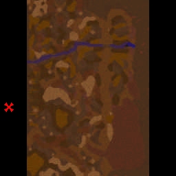
So this is a terrain I made a while ago. It's supposed to be the abyss of helm.
Credits to:
Fingolin for his gondor doodads
Tranquil for his gate
Sunchips for his grass
Some guys for the 4 edge tower and glow
All doodads obtained from UTM
I hope you like!
Notes:
There's no collision on most stuff.
If you don't like my name being there, erase it.
This is a free use total editable resource. Do't bother me if there are two maps or more using this terrain.
A poor template which really needs much more work. Here is what I think:
TERRAIN AND TILES MANIPULATION
You used the tiles in a messy way. I just feel you applied them in a random way. Some tiles mixed together just don't fit well like Rough Dirt and Grass. Tiles that mix well together are Rought Dirt on Dirt, Dark Desert on Desert and Pebbles. However, if you just make a hash of everything, the result is horrible. Next thing is that the terrain is really flat in some large areas where there are cactus and rock spires. I am also really disappointed from the unnatural water you've applied. It looks like it is magically standing and that it is in the form of a cuboid. Pretty strange behavior of water right? Final thing, the raisings on which the walls and the water are standing. What the hell, they have very sharp edges that seem very unnatural. They must be smoothed a bit using the "Smooth" tool in the Terrain Palette
DOODADS MANAGEMENT
Even the doodads have been used terribly. The terrain really feels empty for me with just those few rocky doodads and cactus. Some more environmental "smaller" doodads should be used. The overscaled doodads are not a good idea because the larger a doodad is, the more blurred and less attractive it appears. Those massive rocks and structures you've put obstruct the sight of normal camera view, making the map inadequate for any map genre except cinematic. This makes your template less likely to thrive in here. The solution is using a lot of doodads but of a smaller size so that they appear more attractive and avoid obstructing the camera view. The walls should not be so large as well. You can make them smaller without appearing tiny. As for now, those walls are so massive that units have to "climb" them to get to the top.
OVERALL RESULT
The map really needs much more efforts before being decent enough for an approval. Currently, it is in an unacceptable state so I'll give it 1.5/5 and vote for REJECTION!
Well I kinda made it with one arm broken... yeah probably a bad call. The water was added due request (not from this site) There are small grass doodas you may have overseen. Yeah I know rocks look blurry. I just didn't knew what to do with them. It's walls men, walls ARE supposed to be climbed (for enemies) maybe stairs are lacking right?
The stairs are so large that they cannot be called "stairs" but only "lower walls".
Anyway, yes, I know, walls are supposed to be climbed from enemies but they should not be that lofty. Even the defenders of the walls will need to climb them!
The design of your map looks pretty nice. But it's not possible to see anything of the building ingame. It should be possible to zoom out. Also it should be actually playable. The models are very beautiful and well chosen. The fortress looks nice in the picture but it should also be visible ingame.
This site uses cookies to help personalise content, tailor your experience and to keep you logged in if you register.
By continuing to use this site, you are consenting to our use of cookies.