• Listen to a special audio message from Bill Roper to the Hive Workshop community (Bill is a former Vice President of Blizzard Entertainment, Producer, Designer, Musician, Voice Actor) 🔗Click here to hear his message!
  • Read Evilhog's interview with Gregory Alper, the original composer of the music for WarCraft: Orcs & Humans 🔗Click here to read the full interview.

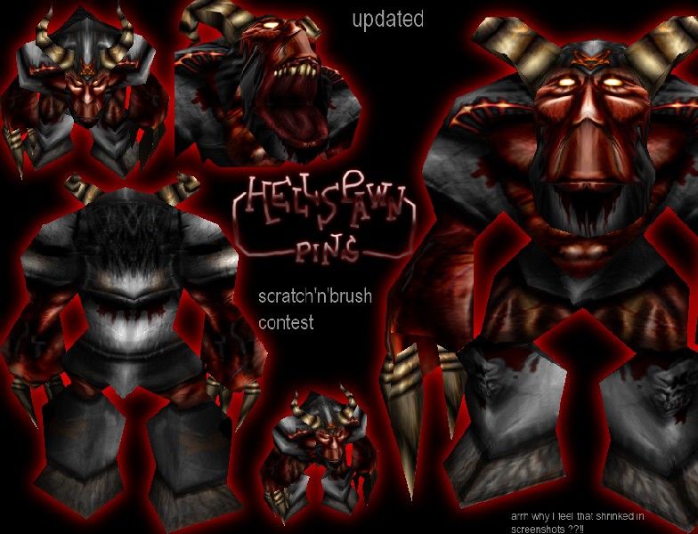
Hellspawnv2

  • Like
Reactions: deepstrasz
Hellspawn

For Scratch & Brush skinning contest.

Updated ! Hooves changed, wrinkles, symbols, legs and some little things.

Keywords:
wendingo, sasquatch, hellspawn, demon, giant, brute, daemon
Contents

Hellspawnv2 (Texture)

Reviews
17:12, 30th Jun 2008 Dan van Ohllus: [Approved] Best skin I've ever seen from you, Pins. Werewulf: Terrible skin, shadings out of whack, too much contrast in alot of areas. Rejected due to quality.
Footman16
Set to approved per: 17:12, 30th Jun 2008 Dan van Ohllus: [Approved] Best skin I've ever seen from you, Pins. Original review. A very good quality free-hand texture, therefore approved.

Moderator

M

Moderator

17:12, 30th Jun 2008
Dan van Ohllus:
[Approved]
Best skin I've ever seen from you, Pins.

Werewulf: Terrible skin, shadings out of whack, too much contrast in alot of areas. Rejected due to quality.
 
Level 11
Joined
Nov 9, 2004
Messages
478
Nice stuff pins.
I know how you feel about the bad wrapping...
I recently did a skin skin with highdetails but low polygons and bad streching.
The mouth has the worst streching from what I see.
Tof ix it make wrinkles going downwards,displacing the teeth almost.
The nose looks too much inhuman.
The pentagrams and the symbols need more highlights.
Give the eyes a downward look and make them reflect light of the armor.
I sugest re-doing the hooves.
Don't change them to boots or anything...
...Its too hot in hell to walk in boots!
The rest doesn't need much change.

4/5
Just update his file and i'll update this.
 
Nice work, Pins. I bet you pushed me down at 4'th in the contest now. (I'm not done yet tho)

Too bad it wraps so bad between his mouth and nose. And the nose looks a bit awkward (Weird, stupid.. Hehe)
You should edit it. Perhaps you should make it less highligthed on his legs, but more on the symbols.
I can see you placed the teeth abit to far down, so their edges don't show up.. you should fix that.
:wink:
 
Level 1
Joined
Aug 24, 2005
Messages
4
:twisted: :twisted: :twisted: :twisted: :twisted: :twisted: :twisted: :twisted: :twisted: :twisted: :twisted: :twisted: :twisted: :twisted: :twisted: :twisted: :twisted: :twisted: :twisted: :twisted:
 
Top