-
Listen to a special audio message from Bill Roper to the Hive Workshop community (Bill is a former Vice President of Blizzard Entertainment, Producer, Designer, Musician, Voice Actor) 🔗Click here to hear his message!
-
Read Evilhog's interview with Gregory Alper, the original composer of the music for WarCraft: Orcs & Humans 🔗Click here to read the full interview.
-
🏆 HD Modeling Contest #7 POLL is live! ✅ Vote for the TOP 3 MODELS! ❗️Poll closes April 28, 2025. 🎬Watch the entries on our YouTube channel! 🔗 Click here to cast your vote!
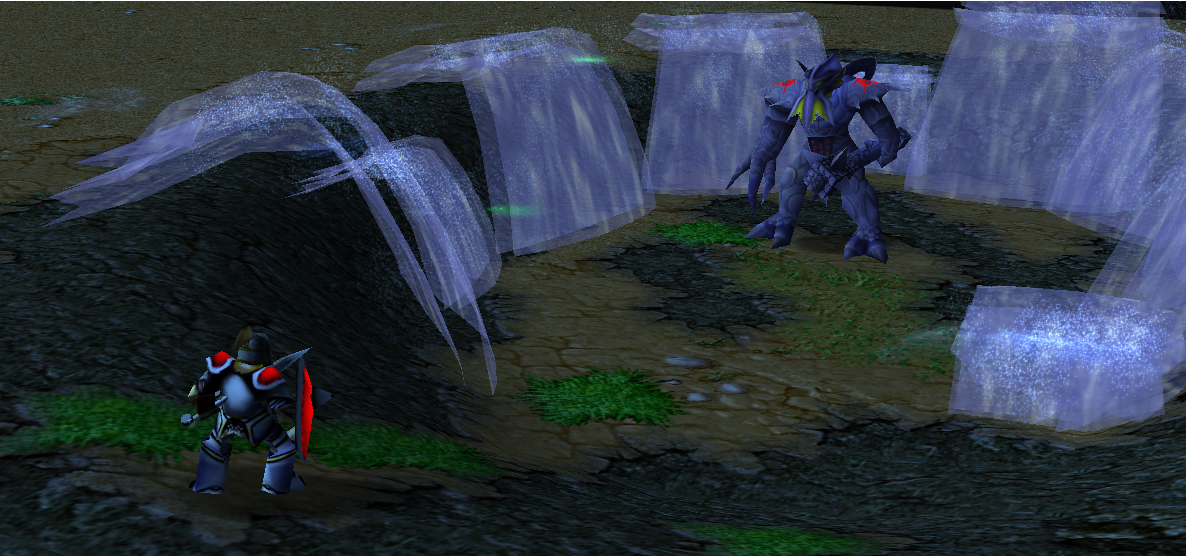
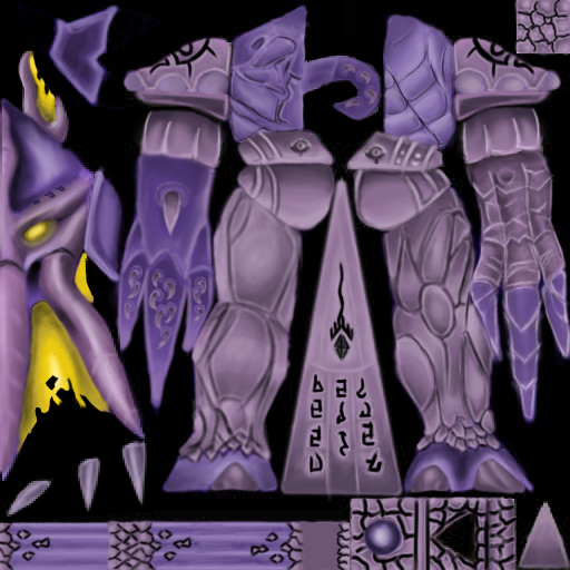
Evolved Faceless One
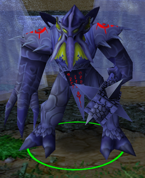
- Author(s)
- aeman
- Tags
- Unit, Fantasy, Neutral / Creep, Contest Entries
- Size
- 330.7 KB
- Rating
- Downloads
- 147
- Created
- Aug 23, 2023
- Updated
- Aug 23, 2023
- Resources
- 1
- State
 Awaiting update
This bundle is marked as awaiting update. A staff member has requested changes to it before it can be approved.


Previews

Reviews


