Community
Maps
Tutorials
Gallery
Support Us
Install the app
-
Listen to a special audio message from Bill Roper to the Hive Workshop community (Bill is a former Vice President of Blizzard Entertainment, Producer, Designer, Musician, Voice Actor) 🔗Click here to hear his message!
-
Read Evilhog's interview with Gregory Alper, the original composer of the music for WarCraft: Orcs & Humans 🔗Click here to read the full interview.
-
💡
We're thrilled to announce that our upcoming texturing contest is in the works, and we're eager to hear your suggestions! Please take this opportunity to share your ideas in this theme discussion thread for the Texturing Contest #34!
-
🏆 Hive's 7th HD Modeling Contest: Icecrown Creature is now open! The frozen wastes of Icecrown are home to some of Azeroth’s most terrifying and resilient creatures. For this contest, your challenge is to design and model a HD 3D monster that embodies the cold, undead, and sinister essence of Icecrown! 📅 Submissions close on April 13, 2025. Don't miss this opportunity to let your creativity shine! Enter now and show us your frozen masterpiece! 🔗 Click here to enter!
You are using an out of date browser. It may not display this or other websites correctly.
You should upgrade or use an alternative browser.
You should upgrade or use an alternative browser.
DarkNight.blp
- Author(s)
- Dalharukn
- Size
- 204.27 KB
- Rating
-
(2 ratings)
- Downloads
- 41
- Created
- Jul 2, 2013
- Updated
- Jul 3, 2013
- Resources
- 1
- State
 Approved
This bundle is marked as useful / simple. Simplicity is bliss, low effort and/or may contain minor bugs.
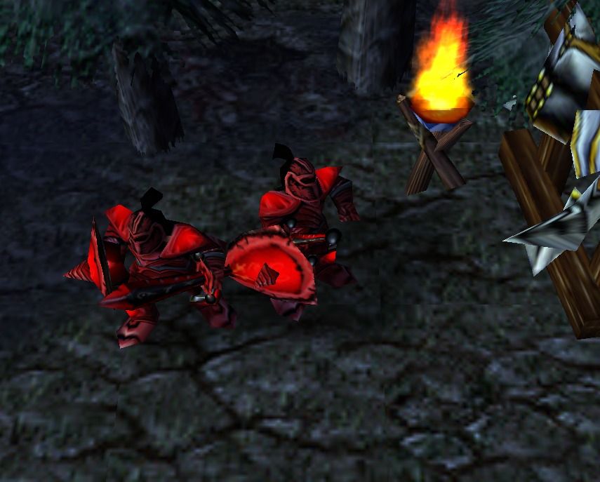
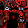
This is a footman reskinned to look a dark night. This is my first skin, i accept criticism and opinions for update it.
Keywords:
footman dark night
Keywords:
footman dark night
Contents
DarkNight.blp (Texture)
- Dimensions
- 256x256
- Import paths
-
- Textures\Footman.blp
- Replacements
-
- Textures\Footman.blp
- Size
- 204.27 KB
- Uploaded
- Jul 2, 2013
- Updated
- Jul 3, 2013
Reviews
- Joined
- Feb 9, 2008
- Messages
- 1,504
I'll be honest.. I feel like I could this exact look by tinting a regular footman 255/0/0
- Joined
- Oct 16, 2008
- Messages
- 10,454
The skin changes (thorny things on the skin) aren't much visible... I only see a red tint as changes...
- Joined
- Jan 12, 2011
- Messages
- 1,197
Nice try, but you should add some textures and highlights to it, to looks much better. Good luck.
Footman16
Community Manager
- Joined
- Jul 14, 2012
- Messages
- 3,654
Have a bit of contrast to bring out the detail. The border of the team-colour should be a different vibrant colour. The hand and back of helmet are far too dark almost black.
Nice job for a first try and at least it is not a recolour so stick at it and you'll get some good results.
Nice job for a first try and at least it is not a recolour so stick at it and you'll get some good results.
Deleted member 212788
D
Deleted member 212788
Changes are too minimal and I feel the red color shouldn't overlap the metalic parts. 1/5
- Joined
- Feb 8, 2013
- Messages
- 1,479
I think the work and effort put into this is substantial. Its not a re-color. It looks like he remade just about every surface, however, it didn't take well. The borders used don't show on the model. I don't think the red color is a reason to reject it but it does look a bit red. More variation in color would be an improvement. With all art and design contrast is an important aspect that brings out the color and accentuates the strength of an image. For example, if some metal was showing, the red would stand out even more (which is the point of this skin, if I'm not mistaken). The helmet looks standard and not anything like the skin (why is this? I don't think its intentional). The .blp image (skin) looks good as a flat image, but does not look as interesting when wrapped on the model. I vote that this remains pending and that Dalharukn be given some more time to make a few adjustments.
- Joined
- Mar 21, 2008
- Messages
- 84
Im gonna update it, i read all opinions and its good the criticism for grow up the skill, actually im in the job but when back house i start it.
You see the new update soon. Another thing, why the texture of shield doesn't show up? Thanks.
You see the new update soon. Another thing, why the texture of shield doesn't show up? Thanks.
- Joined
- Jul 16, 2007
- Messages
- 1,393
I think the work and effort put into this is substantial. Its not a re-color. It looks like he remade just about every surface, however, it didn't take well. The borders used don't show on the model. I don't think the red color is a reason to reject it but it does look a bit red. More variation in color would be an improvement. With all art and design contrast is an important aspect that brings out the color and accentuates the strength of an image. For example, if some metal was showing, the red would stand out even more (which is the point of this skin, if I'm not mistaken). The helmet looks standard and not anything like the skin (why is this? I don't think its intentional). The .blp image (skin) looks good as a flat image, but does not look as interesting when wrapped on the model. I vote that this remains pending and that Dalharukn be given some more time to make a few adjustments.
I'd bother with a decent comment, but he already put it exactly as I would. In addition I'd also suggest you learn how to alpha channel a skin, in example you clearly want those 'cracks' around the shield more realistic, if you alpha a few parts out(learn about alpha channels here:Tutorial made by: Orc-Tamer

edit:
why the texture of shield doesn't show up? Thanks.
The 'texture' of the shield is team colored(the most part), basically drawing over it has no effect unless you edit the team colored parts of the texture(which you need to learn how to edit different channels).
- Joined
- Feb 8, 2013
- Messages
- 1,479
I'd bother with a decent comment, but he already put it exactly as I would. In addition I'd also suggest you learn how to alpha channel a skin, in example you clearly want those 'cracks' around the shield more realistic, if you alpha a few parts out(learn about alpha channels here:Tutorial made by: Orc-Tamer
edit:
The 'texture' of the shield is team colored(the most part), basically drawing over it has no effect unless you edit the team colored parts of the texture(which you need to learn how to edit different channels).
Great point. And if you don't have photoshop or another editor that permits use of layers and transparency, then try pixlr.com/editor It works almost as well as photoshop, just remember to save often so you don't lose your work if you accidently close your web-browser.
- Joined
- Jun 9, 2008
- Messages
- 16,697
bleh.. not really done that cool..
you know what would be better-ish (i think) you do the whole texture as black metal and then all the highlights you do in vivid red. I kinda did it so with my naga automaton skin
you know what would be better-ish (i think) you do the whole texture as black metal and then all the highlights you do in vivid red. I kinda did it so with my naga automaton skin
- Joined
- Sep 8, 2011
- Messages
- 560
1/5 Reject
That's one way to be stupid. Sorry if that offended you. As you had no reason.
Anyways, I suggest you don't make it that red. It looks like a 255/0/0 footman but with a different head. Anyways, for now, 1/5 and either NEEDS FIX or REJECTED


