Listen to a special audio message from Bill Roper to the Hive Workshop community (Bill is a former Vice President of Blizzard Entertainment, Producer, Designer, Musician, Voice Actor) 🔗Click here to hear his message!
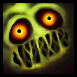
I think the contrast between the colors here is too big, and there's too few transition colors used.
This kinda makes it flat and it doesn't really look like a blob to me, the especially flat area is the mouths where the dripping slimes are really sharply defined and standing out. They also seem to have consistent base color through out their length, you'd probably want to give them depth by making some parts of those dripping spots darker and some highlighted (to show more drip coming down the highlighted areas and less down the shaded areas).
I would also suggest highlight reflection to make it more slimey looking.
Editing is the best way for me to explain my thoughts so I played around with the icon a little bit.
This site uses cookies to help personalise content, tailor your experience and to keep you logged in if you register.
By continuing to use this site, you are consenting to our use of cookies.


 Approved