Approved


Moderator
M
Moderator
15:46, 12th Sep 2009
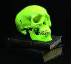
oh_snap: Not bad, but the bottom chin bones look weird. Improve them, by looking at anatomy of an actual skull. The teeth also seem to look off.
Zombie: Changes made, I presume.
oh_snap: Not bad, but the bottom chin bones look weird. Improve them, by looking at anatomy of an actual skull. The teeth also seem to look off.
Zombie: Changes made, I presume.


")

")