• 🏆 Texturing Contest #33 is OPEN! Contestants must re-texture a SD unit model found in-game (Warcraft 3 Classic), recreating the unit into a peaceful NPC version. 🔗Click here to enter!
  • It's time for the first HD Modeling Contest of 2024. Join the theme discussion for Hive's HD Modeling Contest #6! Click here to post your idea!

BTNProudmoore

my icon for my skin Proudmoore.blp
give credit!

check my thread for my recent work : My texturing /creation thread

update : sharpen filter
Zoomed it in
Contents

BTNProoudmoore (Icon)

Deleted member 238226

D

Deleted member 238226

big pic :

sea-captain-big-pic-png.250054
sea-captain-big-pic-2-png.250055


edit : woops, forgot to sharpen it up

should i zoom it?
btnseacaptain-png.250059
btnseacaptain-png.250060
i'm confused.
 

Attachments

  • Sea Captain big pic.png
    Sea Captain big pic.png
    99.2 KB · Views: 830
  • Sea Captain BIG PIC 2.png
    Sea Captain BIG PIC 2.png
    86.8 KB · Views: 844
  • No BG Icon.zip
    32.3 KB · Views: 70
  • BTNSeaCaptain.png
    BTNSeaCaptain.png
    9.2 KB · Views: 552
  • BTNSeaCaptain.png
    BTNSeaCaptain.png
    9.3 KB · Views: 553
Last edited by a moderator:
Level 50
Joined
Mar 22, 2016
Messages
588
This icon is good and in my opinion much better for you to draw it than to screenshot trace it.

You got to fix few things tho. Background: rather keep it black or something complementary to brown. Outlines of his face on left are too sharp, so smoothing or blurring them is good idea. Light source is not defined and you put shadows and lights everywhere. Icon is missing the red part on bottom so add it up to. His mustache need fixing to appear more realistic.
 

Deleted member 238226

D

Deleted member 238226

@Darkfang i more prefer to do my icon from scratch, aswell as improving my drawing skill ^^

@Murlocologist thanks for the detailed feedback :)
i have agreed on some of your points, although somethings i'm not sure if it's really need to fix. i'd like to wait for the mods to speak his/her comment for things that need to be fix before this can be approved. again thanks!
 
Level 8
Joined
Aug 7, 2011
Messages
428
The skin looks great buddy, but his face in the icon looks like he had some kind of mental retardation (no offense).
As Darkfang told you, maybe you could try to do it from a screenshot.
 

Deleted member 238226

D

Deleted member 238226

so many words ><

ok..

i try to update it

btnseacaptain-1-png.250355
btnseacaptain-1-png.250362
 

Attachments

  • BTNSeaCaptain (1).png
    BTNSeaCaptain (1).png
    12.1 KB · Views: 428
  • BTNSeaCaptain (1).png
    BTNSeaCaptain (1).png
    12.1 KB · Views: 400
Level 50
Joined
Mar 22, 2016
Messages
588
Icon is good, much better to draw it than to screenshot trace it, but it lacks in some areas. You use style that is quite different from how blizz icons look like. You have an interesting approach with striking appearance, however since goal is to blend icons with existing game material I'd advise to go after archiving blizz feeling. And I'm viewing from that stance.
So, head is stylized in great amount. Since you chose this face position he should be more/less symmetrical. Space between eyebrows and eyes is unnecessarily large. Mustache aren't properly rendered and are too cartoonish. Face uses one color and two shades of it, which is fine, but kinda dull in overall view at least in my opinion. Also appears quite flat. Colors scheme of other parts is ok, even though I don't fancy the background too much. Shading needs more work. You should also lower size of brush as lines are quite fat. As of right now I would probably rate it with 3 (which I won't cos I never rate anything).
Anyways, icon is good from artistic view, however this style would need alterations to get blizz feeling.
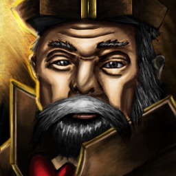
 
If you want to improve it further, Murlocologist pointed out some things pretty well.
I will only add that the nose could also use some work. One more thing about the mustache - think in what direction it grows.
Regarding the shape, size and position of the facial features - i suggest you to study/observe some portrait pics and play around sketching.
You could read some tutorials aswell.
But since it's an corresponding resource and it looks acceptable, i'll approve it.

Edit: You could add it as an "asset" to your skin(Proudmoore.blp).
 
Last edited:
Top