
 Approved


Moderator
M
Moderator
12:28, 24th Apr 2015
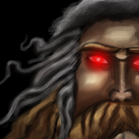
Apheraz Lucent: About the face, first, the nose has too thick outlines, resulting in it appearing detached from the face. If you wanted to make an angry look, you could add some wrinkles on the forehead, just that one doesn't do much for facial expression or overall feeling of emotion for the character. Also, there's the same problem with outlines on the hair and face part, where the hear is too much secluded from the face and therefore does not look natural. Also, the beard and hair colors should match.
To be honest, I'd rather have you redraw entire icon instead of trying to fix things up, because the idea is great, but you tried to execute it in a way that even experienced people would have troubles making it look effective and artistically right.


")


