• Listen to a special audio message from Bill Roper to the Hive Workshop community (Bill is a former Vice President of Blizzard Entertainment, Producer, Designer, Musician, Voice Actor) 🔗Click here to hear his message!
  • Read Evilhog's interview with Gregory Alper, the original composer of the music for WarCraft: Orcs & Humans 🔗Click here to read the full interview.

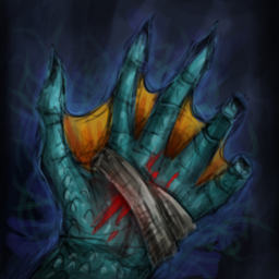
BTNNagaMend

Icon requested by Darklycan51 for his Azeroth Wars map.
Be sure to check it out when it comes out!!!


Version 1:
209078-albums5763-picture71039.png


209078-albums5763-picture71040.png


No credits please!
Edit it if you want!


Btw, BD, I experimented a bit with that glow effect, I think it turned out quite well. Without liquifying it though cuz it looks weird with my comp :D and it lags too much.

Keywords:
Naga, Water, Watery, Mend, Heal, Resurrect, Wound, Wounded, Blood, Ocean, Sea, Deep, Depth.
Contents

BTNNagaMend (Icon)

Reviews
04:00, 24th Jul 2013 enjoy: Can you define it more? If you give it a hard shading at the edge, and then around it, you add a really thing light blue line that blends outward, but really thin! I would make an example for you, but I don't have...

Moderator

M

Moderator

04:00, 24th Jul 2013
enjoy: Can you define it more? If you give it a hard shading at the edge, and then around it, you add a really thing light blue line that blends outward, but really thin! I would make an example for you, but I don't have photoshop on this computer. Bummer. :( It actually already looks like it is lighter around the hand, but a bit more.
I guess what I am asking is sharpen it up and up the saturation a bit! :)

14:07, 3rd Sep 2013
enjoy: A shame that you didn't improve this. It could have been great. No changes made, but might be useful.
 
Level 30
Joined
Nov 29, 2012
Messages
6,637
The icon is really obscure or should we say, I cant understand what that. It doesnt resemble a Naga to me, maybe give a bigger image so everyone here can see what this is because in my case, I cant understand what is this.
 
Level 28
Joined
Aug 7, 2011
Messages
1,638
Oh. Iamtherper, I didn't notice that sry xD ah. Actually. this was supposed to be a naga tail but I added too many stuff I guess. + the bandages don't look like bandages... okay I'll remake it.

But let me explain what it is:
it's a naga tail underwater. 2 algae on the right and left side. Bubbles to represent underwater. Damaged naga tail (blood). + Bandages around it. lycan wanted me to make a Naga Heal Underwater.. Well, I don't have many ideas of how that might look like so I decided to make it like the Mend Pet ability from WoW. But.. if anyone has better ideas I would gladly accept them :cgrin:

I'll try to edit this though.
 

Roland

R

Roland

Such a Very nice icon, the Shading is terrific and the colors are outstanding!

I'll rate it 30/30+ 500
 
morbent said:
Btw, BD, I experimented a bit with that glow effect, I think it turned out quite well. Without liquifying it though cuz it looks weird with my comp :D and it lags too much.
Ah, I see. That's such a damn shame, liquifying stuff results in pwetty effects. :V

Your icons are still rather undefined, because your large feature many sketchy lines.
That's totally fine for concepts etc, but you should improve definition of your submissions.
Yeah, I know you don't want to spend eternity on stuff (and frankly, so does CRAZYRUSSIAN), but it's worth it. ;)
 
Level 28
Joined
Aug 7, 2011
Messages
1,638
Heh, yeah :D But Crazyrussian does his detail well :\ defined and all.
It's not only the time though. At times I really don't know how to fix a specific thing - make it more detailed. For example, we have a.. a sheet. How do I add detail to a sheet of paper? If it isn't in any perspective, etc. --> it has no light, it has no places to add different color to. I can add a texture of course. But.. does a sheet of paper have such a defined texture? Like a stone? no. So .. how do I add the detail? There are other weird cases in which, the blurry thing looks better than the defined one o_O So how do I make the detailed one be better than the one I had before? Details are.. goddamn hard to make :D


I guess it's the fact that I can't make clear lines yet, that stops me from making detail... they would fix everything. The form will have good outlines and it would look good :|
 
Level 28
Joined
Aug 7, 2011
Messages
1,638
Me too.


But I decided that, well.. urgh, this is a ... tiny little detail that we can skip ;D
At first I wanted to make a wound (hole) into the thumb fin, but then I thought "who would care anyways, with the hole it would look stupid!" and if I put the wraps someplace else, it would look stupid again :cgrin:

so. Better be "fuck logic" than "fugly shit" ;D not that it isn't ugly now...
 
Top