Approved


Moderator
M
Moderator
21:09, 29th Dec 2015
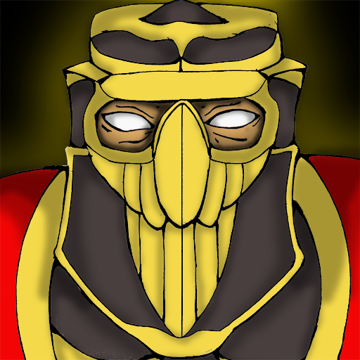
Sin'dorei300: I strongly recommend you to add shading(highlights and shadows, using lighter or darker tones of your base colors), this will visibly improve your icon.
Awaiting update.
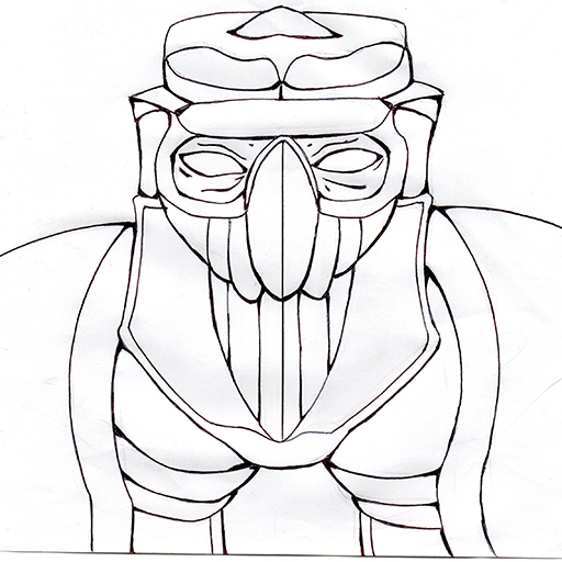
Sin'dorei300: I strongly recommend you to add shading(highlights and shadows, using lighter or darker tones of your base colors), this will visibly improve your icon.
Awaiting update.