
 Approved


- Joined
- Sep 23, 2012
- Messages
- 1,304
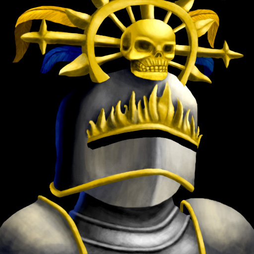
The transition between the helmet and the shadow is unnatural, consider smoothing them up abit, it'll look better in icon size.
I'd add some light-blue to the feathers so they won't feel lonely staying behind.
You also forgot to shade the golden line part, I thought it was some kind of mustache on first sight. Dark-orange works fine when shading gold stuff.
My rough example:

I'd add some light-blue to the feathers so they won't feel lonely staying behind.
You also forgot to shade the golden line part, I thought it was some kind of mustache on first sight. Dark-orange works fine when shading gold stuff.
My rough example:


")