• Listen to a special audio message from Bill Roper to the Hive Workshop community (Bill is a former Vice President of Blizzard Entertainment, Producer, Designer, Musician, Voice Actor) 🔗Click here to hear his message!
  • Read Evilhog's interview with Gregory Alper, the original composer of the music for WarCraft: Orcs & Humans 🔗Click here to read the full interview.

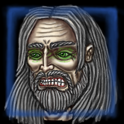
BTNKirinTorWarmage

Finally decided to make a new icon for my Kirin Tor Warmage skin. Trying some new techniques and whatnot.

Old vs New:
150077-albums4247-picture54639.png
150077-albums4247-picture75832.png


150077-albums4247-picture75833.png


Have fun, and give credits if you use this icon!

Keywords:
Kirin, Tor, Warmage, Dalaran, Lordaeron, Mage, Wizard, Sorcerer, Spellcaster, Hero, Bloodmage
Contents

BTNKirinTorWarmage (Icon)

Reviews
19:52, 7th Nov 2013 enjoy: Might be useful.
Level 30
Joined
Jan 31, 2010
Messages
3,552
A great start, I'll dare to say, but there are some technical details that could use some more work.

The hair is a lot lighter than on the coresponding skin, and the beard is covering a little more of face than it actually does.
The mouth is, unfortunately, lost somewhere in there, and only a slight pink touch and few teeth are visible, but it could work this way.
As for the eyes, why are they all covered in green? Maybe they aren't, but the coloration method you've used gives that impression.

I know this is a fitting icon, and that it will get approved, but why not to put some love in it? :wink:
 
Level 25
Joined
Jun 3, 2008
Messages
3,858
A great start, I'll dare to say, but there are some technical details that could use some more work.

The hair is a lot lighter than on the coresponding skin, and the beard is covering a little more of face than it actually does.
The mouth is, unfortunately, lost somewhere in there, and only a slight pink touch and few teeth are visible, but it could work this way.
As for the eyes, why are they all covered in green? Maybe they aren't, but the coloration method you've used gives that impression.

I know this is a fitting icon, and that it will get approved, but why not to put some love in it? :wink:

Most of what you mentioned was done intentionally. I don't like the idea of icons being an exact representation of their corresponding resources. To me they're more like an artistic impression, where you're able to apply details that the model or skin wouldn't allow you to. For example, working with the bloodmage skin, I would've had to do model editing for him to have a bigger beard, as I was restricted to the shape of the model. Here, I can make it as big as I fucking want.
As for the mouth, you'll have to expect some of the detail work being lost in the conversion. You can still tell what it's supposed to be, which is really all I wanted.
The eyes, on the other hand, was me attempting to make a glow effect, using another method than I would've normally used. It didn't turn out quite like I had expected, and I might go back and change that, but I wouldn't count on it.

If I didn't put any love into this, I would've simply taken a screenshot of the mage, added some highlights here and there, smoothed out the edges, and not bother drawing his entire face from nothing.
 
Top