• 💀 Happy Halloween! 💀 It's time to vote for the best terrain! Check out the entries to Hive's HD Terrain Contest #2 - Vampire Folklore.❗️Poll closes on November 14, 2023. 🔗Click here to cast your vote!
  • 🏆 Texturing Contest #33 is OPEN! Contestants must re-texture a SD unit model found in-game (Warcraft 3 Classic), recreating the unit into a peaceful NPC version. 🔗Click here to enter!
  • 🏆 HD Level Design Contest #1 is OPEN! Contestants must create a maze with at least one entry point, and at least one exit point. The map should be made in HD mode, and should not be openable in SD. Only custom models from Hive's HD model and texture sections are allowed. The only exceptions are DNC models and omnilights. This is mainly a visual and design oriented contest, not technical. The UI and video walkthrough rules are there to give everyone an equal shot at victory by standardizing how viewers see the terrain. 🔗Click here to enter!

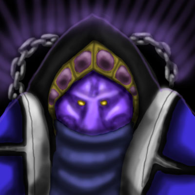
BTNHeroMastermind

Icon i made for Ampharos_222's awesome Faceless model.
The model is here
All is 100% freehand, no Screenshot parts.
194769-albums4261-picture49794.jpg

Enjoy :)

Keywords:
faceless one, hero, mastermind, mental, power, powerful, mage, wizard, warlock
Contents

BTNHeroMastermind (Icon)

Reviews
16:15, 7th Aug 2011 enjoy: Fits the model very nicely. Corresponding resource approved.

Moderator

M

Moderator

16:15, 7th Aug 2011
enjoy: Fits the model very nicely. Corresponding resource approved.
 
Looks decent, it fits the model very well.
I give this a 3/5. The problem with creating icons for models is that you're limited as to what you can do.
In order to bring out your creativity, your icon has to come from your mind, rather than something you see. That's the main reason that, when I look at your other icons which did come from your mind, I see that they look better. Of course, since the entire point of this icon was to match a model, you didn't have much choice in creativity.
Overall, this icon serves its purpose, and fits in about average.
Btw PeeKay, your icons are too epic, don't compare others to yours. Your icons will make someone else's 5/5 look like crap.
 
Level 29
Joined
Sep 11, 2009
Messages
1,812
He looks retarded to me because he [why he looks retarded].. Also he looks fat because [reason for why he looks fat]..
I would change it by [suggestions on how to change it]

EDIT: I see moderator (Enjoy) changed my post..

He looks retarded because of the way he's hiding in his veil, Looks like he just threw a paper ball on his teacher and then hid in his veil to laugh. Also, the eyes aren't symmetrical.

He looks fat because of his Cheeks, they are too round

Other things i would change : The angles you did aren't the same everywhere.

ALSO : - ENJOY - : ''You call that constructive? Let me show you how it's done..'' WELL.. 16:15, 7th Aug 2011
ENJOY: ''Fits the model very nicely. Corresponding resource approved''.

Looks like you failed to show me.
 
Last edited:
Top