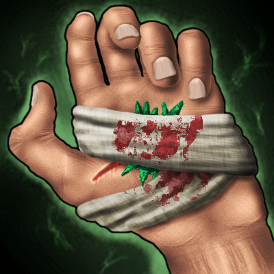
Your icon isn't that bad, but the anatomy is off, and it needs stronger shading.
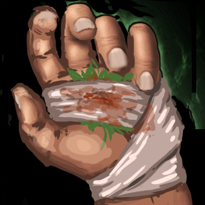
I want to give you an idea of what you need to do with it, so I took the liberty to fix it up a bit. It took me about 10 minutes to do this with your icon, so I am sure you can too.
First, let me show you the change next to your drawing, and then I will explain beneath.
So basicly, the thumb is too long, so I've shortened it. I selected the thumb with the lasso, and moves it down, since the palm of the original hand is too wide near the bottom of it.
I changed the angle of the tip of the thumb. That way, you don't have to redo all of the tip.
I moved the arm and the bottom of the palm to to the right. The right lower corner of the palm I moved a bit up, to fit the perspective.
I selected the fingers and top of the palm, and made them bigger, since they are too short. I moved them down, so that they could fit in the frame. I also used the grid transform tool in photoshop, to fit the fingers a bit better. (when you select a part and press ctrl+t, you can see this
. That's grid transform tool.)
I painted in between the moved parts with the base skin tone.
The cloth should bend up since it's tight around the hand, and therefor should follow the hands shape, and we are looking at it from a kind of downward angle.
Also, the way you have drawn the cloth would not really be giving the hand any support, and also would probably slide easy off, so it the cloth should go down around the wrist.
So I redrew the cloth.
So, I hope that helps
")
After that, you should add darker shading. Good luck with it.

 Approved