• Listen to a special audio message from Bill Roper to the Hive Workshop community (Bill is a former Vice President of Blizzard Entertainment, Producer, Designer, Musician, Voice Actor) 🔗Click here to hear his message!
  • Read Evilhog's interview with Gregory Alper, the original composer of the music for WarCraft: Orcs & Humans 🔗Click here to read the full interview.

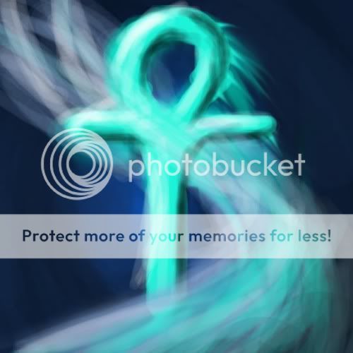
BTNHealingWind3

This bundle is marked as useful / simple. Simplicity is bliss, low effort and/or may contain minor bugs.
Okie 3rd icon.

Am gonna continue making icons evan if their crap, i'll be good one day i hope.

My icons are inspired on all sort of types od Guild Wars icons because i liek guild wars icons :)

Could be used as a heal or something, please criticism :D

Keywords:
Heal, Healing, Wind, Devine, Judgement
Contents

BTNHealingWind3 (Icon)

Reviews
10:59, 14th Jul 2009 zombie2279: Bring the object more into foreground by adding more correct outlines and add some details to the cross, preferably more colors and decorations. 8:52, 17th Jul 2009 zombie2279: Rejected until updated.

Moderator

M

Moderator

10:59, 14th Jul 2009
zombie2279: Bring the object more into foreground by adding more correct outlines and add some details to the cross, preferably more colors and decorations.

8:52, 17th Jul 2009
zombie2279: Rejected until updated.
 
Level 8
Joined
Mar 28, 2009
Messages
247
YOu can redo it if you attatch the photoshop file. Would be doss if you filmed it xD i wanna learn xD

Edit: I made it more defined. I hope this is what you wanted. Still feel free to make a redo Pala i wan't to see what it's meant to look like, helps me learn. Actually anyone can feel free to make a redo of any of my Icons, just needs to include a big picture or a PSD file.


Picture like so :D
HealingWindUpdatebigcopy.jpg

-Somnium
 

Attachments

  • HealingWind Update big.psd
    1.9 MB · Views: 52
Last edited:
Level 5
Joined
Dec 12, 2008
Messages
141
erm, i like the concept and the wind looks good.
but i want to mention that i think the outlining and shadows and what-not improve the solidity of the symbol, however some of those wavy lines make it look a bit scratchy, mebe straighten the lines a bit more, i dunno what others think but thats my opinion.
 
Top