
Moderator
M
Moderator
16:32, 13th Feb 2014
Sin'dorei300: Nice composition.
Sin'dorei300: Nice composition.
Follow along with the video below to see how to install our site as a web app on your home screen.
Note: This feature may not be available in some browsers.

(6 ratings)
 Approved
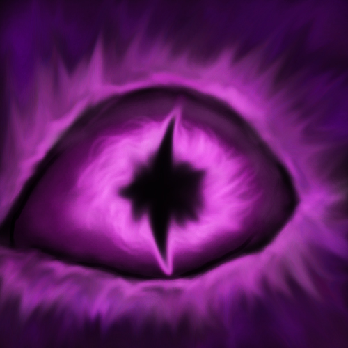
| Eye of Darkness |
|


Looks really great although I would upload it as an file if I were you rather than a link and then put it in a [HIDDEN] tag since it's so large.[/QUOTE]
Thanks for hint, hehe, i edited it. The image its large because its on 1920x1080p :)
When finish the main concept i upgrade the eye , i don't know the final result :)


It's a hard question since both look good and are appropriate for demons but I'll have to say the red one.

")

I would like it more if it were both eyes.
It looks odd just being one, with how the eyes are shaped.
Or show the full half-face.
Sauron?
 !
!


