
• Listen to a special audio message from Bill Roper to the Hive Workshop community (Bill is a former Vice President of Blizzard Entertainment, Producer, Designer, Musician, Voice Actor) 🔗Click here to hear his message!
  • Read Evilhog's interview with Gregory Alper, the original composer of the music for WarCraft: Orcs & Humans 🔗Click here to read the full interview.
  • The Hive's 22nd Icon Contest: Creep Abilities is now concluded, time to vote for your favourite set of icons! Click here to vote!
  • ✅ The POLL for Hive's Texturing Contest #34 is OPEN! Vote for the TOP 3 SKINS! 🔗Click here to cast your vote!
  • ✅ The POLL for Hive's Techtree Contest #20 is OPEN! Vote for the TOP 3 FACTIONS! 🔗Click here to cast your vote!

BTNDragons

Some nice dragons chillin'.
100% freehand. Credit to StaberFire if used or modified.

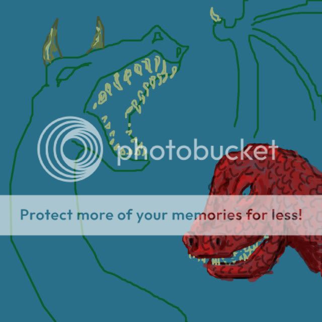
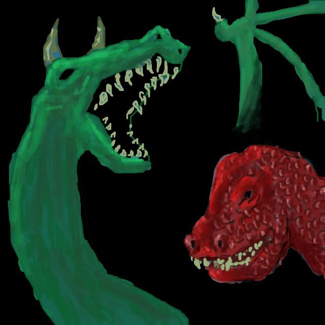
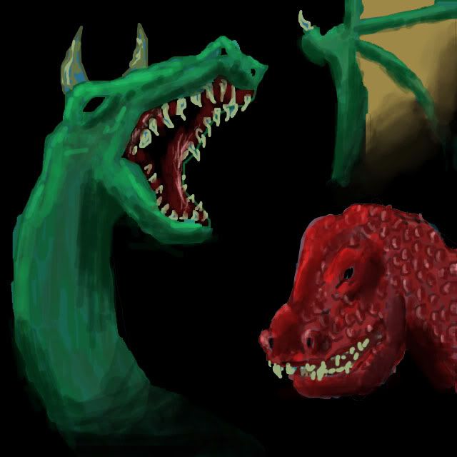
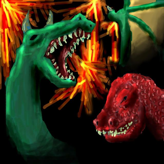
Teh WIPs, tehy burn!
DragonsWIP1.jpg


DragonsWIP2.jpg


DragonsWIP3.jpg


DragonsWIP4.jpg


DragonsWIP5copy.jpg


UPDATE1: Dimmed the background and changed the colour of the red dragon.
UPDATE2: Re-shaped the red dragon's jaw and made new teeth, smoothed and re-defined the eye, added more shading and highlights and a fire glow to the dragons.

Keywords:
Dragon, Dragons, Fire, Lizard, Lizards, Dinosaur, Dinosaurs.
Contents

BTNDragons (Icon)

Reviews
21:29, 22nd Oct 2009 enjoy: The green I can see is a dragon..The red one looks alittle retarded? I think it's the mouth, and that the eyes looks really big on the icon size. Would be good if you fixed that. Well, the fire would cause alot of light...
21:29, 22nd Oct 2009
enjoy: The green I can see is a dragon..The red one looks alittle retarded? I think it's the mouth, and that the eyes looks really big on the icon size. Would be good if you fixed that. Well, the fire would cause alot of light, so more highlights. Also define them more. Also more shading. Also the highlihts should be redish because of the fire.

enjoy: Try to give the red one some horns maybe?

enjoy: No futher changes made. approvable.
 
Back
Top