-
Listen to a special audio message from Bill Roper to the Hive Workshop community (Bill is a former Vice President of Blizzard Entertainment, Producer, Designer, Musician, Voice Actor) 🔗Click here to hear his message!
-
Read Evilhog's interview with Gregory Alper, the original composer of the music for WarCraft: Orcs & Humans 🔗Click here to read the full interview.
-
🏆 HD Modeling Contest #7 POLL is live! ✅ Vote for the TOP 3 MODELS! ❗️Poll closes April 28, 2025. 🎬Watch the entries on our YouTube channel! 🔗 Click here to cast your vote!
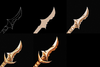
BTNDagger

- Author(s)
- PrinceYaser
- Tags
- CommandButton, Item, Spell / Ability, Historic, Fantasy, Neutral / Creep, Dwarf, High Elf, Human, Naga, Night Elf, Orc, Blood Elf
- Size
- 32.03 KB
- Rating
- Downloads
- 317
- Created
- Aug 10, 2017
- Updated
- Aug 11, 2017
- Resources
- 1
- State
 Approved
This bundle is marked as recommended. It works and satisfies the submission rules.

Dagger...
Enjoy!")
Keywords: Dagger, Metallic, Metal, Weapon, Sword, Gold, Golden, Yellow, Orange, Icon, Item, PrinceYaser, Human, Elven, Warcraft
Enjoy!
Keywords: Dagger, Metallic, Metal, Weapon, Sword, Gold, Golden, Yellow, Orange, Icon, Item, PrinceYaser, Human, Elven, Warcraft