Moderator
M
Moderator
10th Dec 2009
Pyramidhe@d: Looks useful.
Pyramidhe@d: Looks useful.

(4 ratings)
 Approved
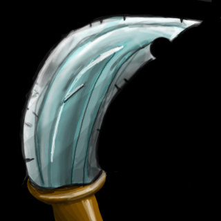


- Keywords : Excuse me?...It looks like a freaking feather...and if that would be a "special" type of sword, what purpose would it have?Keywords: Curved, Kurved, Blade, Sword, Attack, Awesome, Narandza, Blue, Cool, Cold.

I think is sucks because its not my taste,voting for Rejection
,I choose my words carefully,but what else can u say? I'm a beginner,voting for rejection because this icon do not fit in Wounding Stab nor even the attack icon,its pretty useless you see?Lol newbie hahah look your icons omg hahah


lol usually daggers are curved it is like that because when they go in the flesh and you pull them out it makes big wounds same as for arrows ;] Daggers are designed for assassination