• 🏆 Texturing Contest #33 is OPEN! Contestants must re-texture a SD unit model found in-game (Warcraft 3 Classic), recreating the unit into a peaceful NPC version. 🔗Click here to enter!
  • It's time for the first HD Modeling Contest of 2024. Join the theme discussion for Hive's HD Modeling Contest #6! Click here to post your idea!

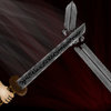
BTNBreaksword

This bundle is marked as useful / simple. Simplicity is bliss, low effort and/or may contain minor bugs.
Another one of my rage icons i made it for practise if u have any sugestions post them here

Update: Made it better i guess

Updated: Made it angeld and toned down the swing

Keywords:
Sword, Rage, Break, Destroy
Contents

BTNBreaksword (Icon)

Reviews
03:06, 16th Oct 2009 Pyramidhe@d: the way you did the blur looks like the sword is just moving in a straight line, not swinging in an arc motion also make the broken sword more visible. right now, it is quit tiny and doesn really look like anything...

Moderator

M

Moderator

03:06, 16th Oct 2009
Pyramidhe@d: the way you did the blur looks like the sword is just moving in a straight line, not swinging in an arc motion
also make the broken sword more visible. right now, it is quit tiny and doesn really look like anything
also, put some light source where the sword breaks. like as if the sword is sparking as it collides
 
It really lacks all the proper definition it needs to look like what your trying to make it look like.
First, the swipe doesn't look like its swiping that much. it just looks like a mess of straight, smudged lines in the corner of the icon. Try to make it feel as if the sword is swiping down in a different manner. Maybe try adding faded images of the swiping sword behind it. or clear up the lines a bit. Just make it look creative and realistic.

The swords themselves look like a bit of a mess. try to define the hilts of the swords in the icon a bit more, to show that they are swords, or make the swords a lot thicker or more clear to see. Also, try to add some bright highlights onto the swords. i hardly belive you see many civilized swords that have a grey colour that is more black than white. Don't be afraid to highlight all the way to white to get a more metal feeling.

The BG is good. i like it. it adds a bit of action to the icon. try to brighten it just a TAD not too much that it distracts, but just bright enough to see the decent pattern in the BG.

2/5

~Dentothor

EDIT: lol 4 posts came up while i was typing :p
 
Top