• 🏆 Texturing Contest #33 is OPEN! Contestants must re-texture a SD unit model found in-game (Warcraft 3 Classic), recreating the unit into a peaceful NPC version. 🔗Click here to enter!
  • It's time for the first HD Modeling Contest of 2024. Join the theme discussion for Hive's HD Modeling Contest #6! Click here to post your idea!

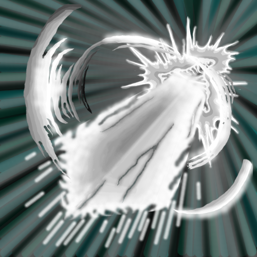
BTNBladeShapedEnergyBlastWM

This bundle is marked as useful / simple. Simplicity is bliss, low effort and/or may contain minor bugs.
Introduction: An energy blast which looks like a blade. This is called blade-shaped energy blast!

Used tools:
  • Gimp
  • Button Manager

245746-albums8339-picture102706.png


245746-albums8220-picture102764.png


Credits:
  • Gimp
  • Button Manager

Keywords:
Blast, blade.
Contents

BTNBladeShapedEnergyBlastWM (Icon)

Reviews
16:56, 26th Oct 2015 Apheraz Lucent: You need to define the blade a bit more. Even if it's a sword made entirely of energy, it still needs to show a shape so people can recognize what it is from the first glance. Overall, needs a bit more definition...

Moderator

M

Moderator

16:56, 26th Oct 2015
Apheraz Lucent: You need to define the blade a bit more. Even if it's a sword made entirely of energy, it still needs to show a shape so people can recognize what it is from the first glance. Overall, needs a bit more definition, and if I were you, I'd try to add a very slight touch of some colors there, such as very light tone of blue.
 

Winimasker

W

Winimasker

?.?

Why is my uploaded BTNBladeShapedEnergyBlastWM more blur than the reviewed BTNBladeShapedEnergyBlastWM in the button manager during the comparison between them? ... @.@

245746-albums8220-picture102710.png


???

I don't have idea. I thought it should be clearer. Isn't it???
 
Level 12
Joined
May 28, 2015
Messages
382
?.?

Why is my uploaded BTNBladeShapedEnergyBlastWM more blur than the reviewed BTNBladeShapedEnergyBlastWM in the button manager during the comparison between them? ... @.@

245746-albums8220-picture102710.png


???

I don't have idea. I thought it should be clearer. Isn't it???

The hive always make your icons look shitty and blurry in the preview.. It happens to me too
 

Winimasker

W

Winimasker

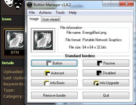
I finally figure out the reason/trouble the icon always becomes blurred... Button Manager decreases the quality of the icon after the icon is converted to BLP format in Button Manager. (the truth)

Edit:
I discover that there is quality setting which is set to 50% by default in Button Manager...

I confuse myself...
 
Last edited by a moderator:
Top