• 🏆 Texturing Contest #33 is OPEN! Contestants must re-texture a SD unit model found in-game (Warcraft 3 Classic), recreating the unit into a peaceful NPC version. 🔗Click here to enter!
  • It's time for the first HD Modeling Contest of 2024. Join the theme discussion for Hive's HD Modeling Contest #6! Click here to post your idea!

BTNAvalanche

This bundle is marked as useful / simple. Simplicity is bliss, low effort and/or may contain minor bugs.
  • Like
Reactions: ILH
Avalanche with a falling tree.
Give credit if you use this.

v6.0 changelog:
- Changed the background
- Added more shading under the avalanche
- Changed some settings in the Button Manager so it doesn't ruin the icon
v5.0 changelog:
- Brighter sky
- More shading, lighting and more prominent details
v4.0 changelog:
- Put more shading
- Emphasized the details
- Brightened the outlines of the snow
v3.0 changelog:
- Emphasized every image change done in v2.0
- Put more emphasis, shading and lighting
- Added more elements
- Reduced the size of the snowflakes, and they now differ in shape
- Undid the minor file size changes from v2.0 for quality's sake
v2.0 changelog:
- Made the tree more realistic and complex
- Added a shadow on the snow under the tree
- Added shading, lighting, ripples and more colours to the snow
- Added shading and lighting to the avalanche
- Brightened the outlines of the snow
- Added the falling snowflakes
- Changed the original icon image file type and compressed the icon images, so the button file size is reduced

Keywords:
avalanche, snow, tree, falling, shading, lighting, background, blue, winter, nature, pine, snowflakes
Previews
Contents

BTNAvalanche (Icon)

Reviews
22:21, 15th Feb 2016 GhostThruster: there is next to zero details and shading (not to mention it's oddly bright considering the night sky backdrop). looks far too plain and flat for an icon, aim to build up some details and give the icon some form...

Moderator

M

Moderator

22:21, 15th Feb 2016
GhostThruster: there is next to zero details and shading (not to mention it's oddly bright considering the night sky backdrop). looks far too plain and flat for an icon, aim to build up some details and give the icon some form. use reference pictures of avalanches and look up a few 2d art tutorials on the hive to see how you should shade them.

14:16, 17th Feb 2016
GhostThruster: update is better, but still lacks details and shading. the sky is still inconsistent with the foreground's lighting.
 

Roland

R

Roland

I love this! But it needs some detailing on the trees and the snow, It needs some realism or some cartoon-styled design :) Great work pal!
 

SpasMaster

Hosted Project: SC
Level 23
Joined
Jan 29, 2010
Messages
1,969
Seems way too simple to me. Add some details, try to make the snow look better and not just a plain white field. Look for references such as the one below. Possibly include snow that is falling in the direction of the wind.

tumblr_n5m6xftp1J1t8epfao4_1280.jpg

I'd also look for some pine trees artworks to serve as reference when improving the falling tree (because no tree looks like a perfect triangle, especially ones that are being dragged down by an avalanche).
In my opinion, your icon is not approvable in its current state. Try to improve it by including details, reading some tutorials and using some reference images to help you out. Good luck!
 
Level 15
Joined
Sep 6, 2015
Messages
576
GhostThruster said:
22:21, 15th Feb 2016
GhostThruster: there is next to zero details and shading (not to mention it's oddly bright considering the night sky backdrop). looks far too plain and flat for an icon, aim to build up some details and give the icon some form. use reference pictures of avalanches and look up a few 2d art tutorials on the hive to see how you should shade them.
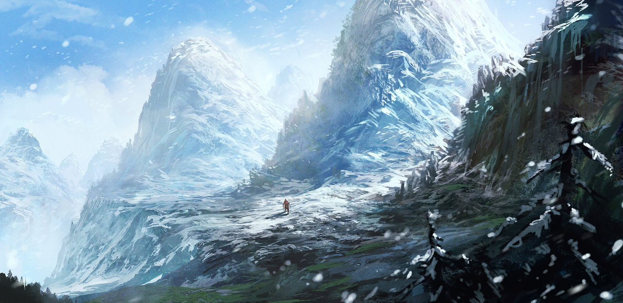
It's not a night sky, it's simply a gradient background like you see in many icons which are shaded as if there is light although the background is dark. I decided to go with that since when it had the sky there was less emphasis on the main, front part of the picture and it didn't look like an icon, but either like a painting, like this one, for example:
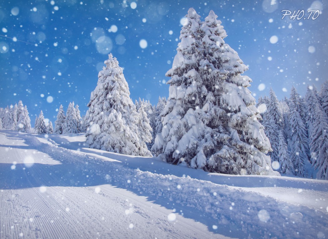
 http://www.hiveworkshop.com/forums/icons-541/btnsnowstorm-99170/. Not to mention that half of the shading, lighting and details are lost when the icon is converted. I tried to emphasize them and partly succeeded, but still the snow must look bright and not too colour-filled under a day sky and it's simply like that in real life:
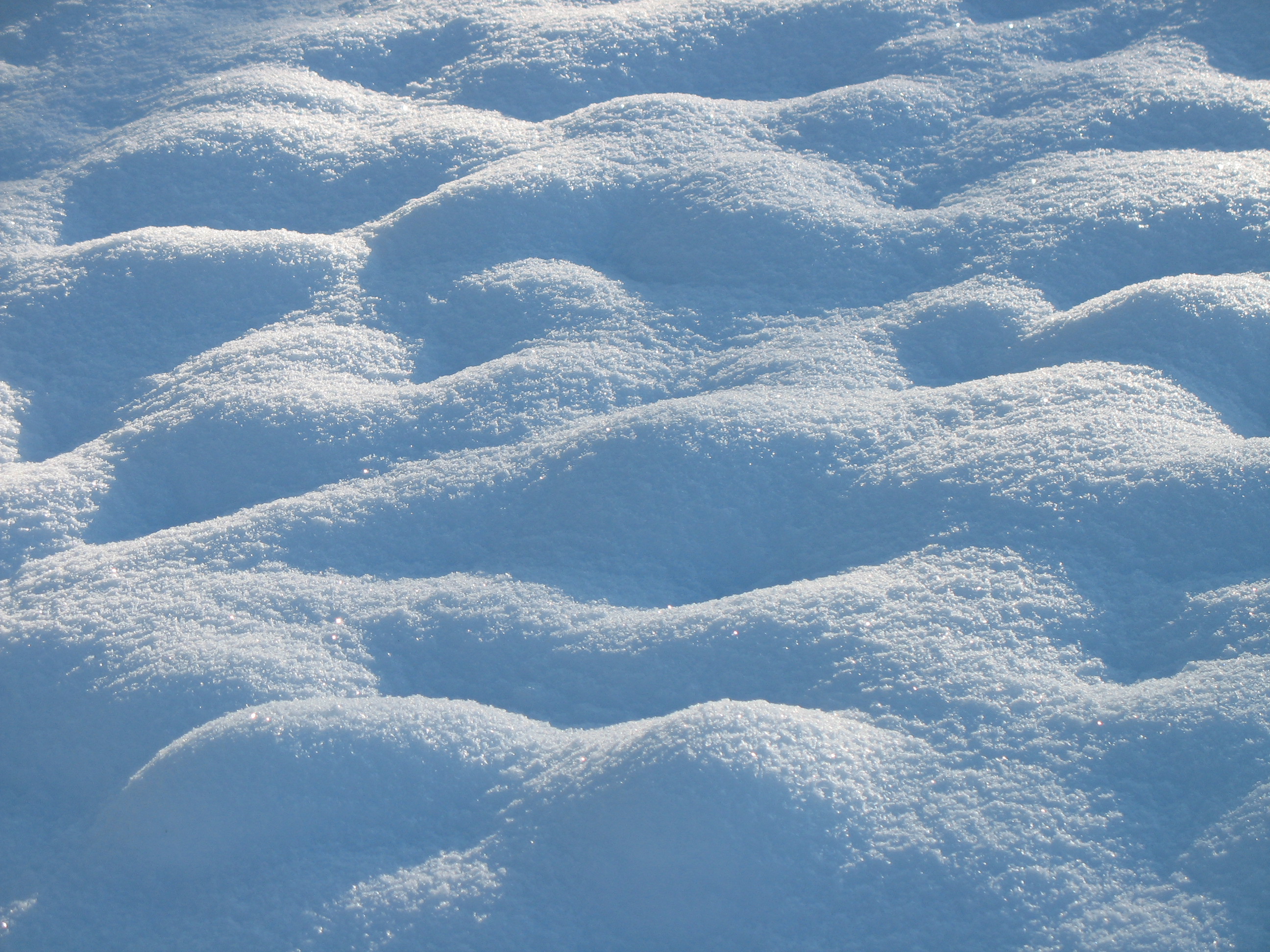
The shading under the tree looks the same as on this image and the snow is simple with just ripples, where it is flat:
falling_snow_effect.jpeg

Although the details on the tree in the icon can still be hardly seen, although I emphasized it and it should be a Warcraft 3 tree in the icon and not a real tree.
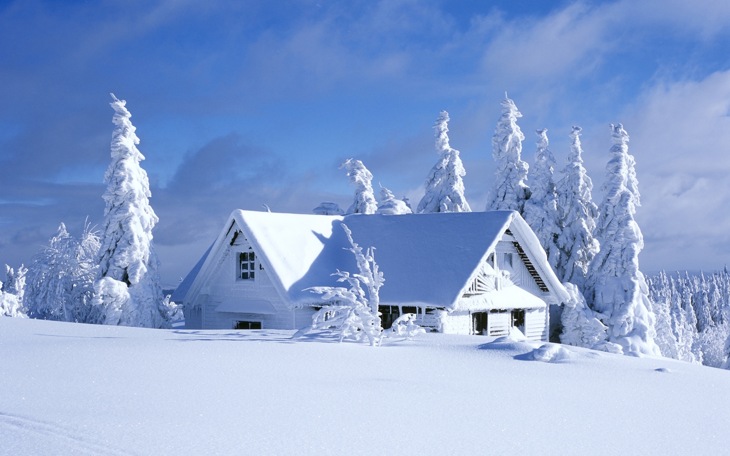
Here is some flat snow:
snow-6.jpg

And here is the ripply effect I added to the snow, although it is under a near-midday sun in the icon so it has less shading:
Field-with-snow-champ-enneige.jpg

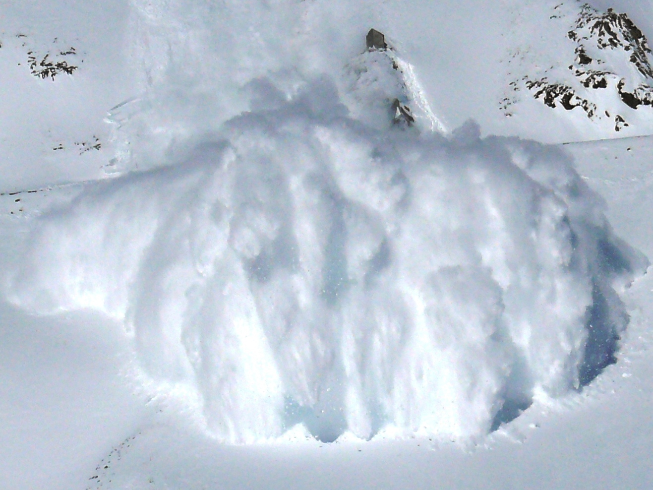
And finally here is an avalanche, although my avalanche is simplified and with simple shading and lighting and it has the motion lines to show that it is moving and the snow is again a plain white field:
2007-02-15-CLB-Couloir2-1c.JPG

But I know that strange are the ways of Warcraft 3 icon making and that everything should be ten times more emphasized and shaded and lighted, and doesn't need to have much relation to reality in some aspects. I can try to improve this, although right now I'm left only with a 64x64 picture since I had saved the small picture in the big picture file accidentally, but it won't be like under a night sky since it isn't, and you should change your review if it was the main reason why the icon is set to "needs fix".
 
it looks like a night sky, therefore to any viewer of the icon it is a night sky. make the background brighter, then it won't look like a night sky and will remain consistent with the foreground's lighting.

i'm sorry but your icon's shading & details don't resemble any of those images. your flat snow is fine enough (though still some more details & texture wouldn't hurt) - as is the shadow the tree casts onto the snow, but your tree looks like this when it should look like this, and you avalanche looks like this when it should look like this. not to mention the proportion of the tree to the avalance is really weird - either that's a really big pine, or the avalanche is tiny.

please do try to improve. like i said, look up tutorials and use reference pictures.
as for your icon, no the night sky was not the only reason. the primary reason is that it lacks shading and detail. your updated icon still isn't of an approvable standard. i suggest you try build some experience up, work on subjects easier to paint - like swords, equipment etc. - before moving onto something as complex and detailed as a landscape.
 
Top