• 🏆 Texturing Contest #33 is OPEN! Contestants must re-texture a SD unit model found in-game (Warcraft 3 Classic), recreating the unit into a peaceful NPC version. 🔗Click here to enter!
  • It's time for the first HD Modeling Contest of 2024. Join the theme discussion for Hive's HD Modeling Contest #6! Click here to post your idea!

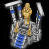
BTNAltarOfKings

This bundle is marked as useful / simple. Simplicity is bliss, low effort and/or may contain minor bugs.
  • Like
Reactions: deepstrasz
"Here are summoned the brave ones who's destiny is to be a noble, pride and just hero. Once slain in battle, they are revived at this altar."

Feel free to comment, as it would help to improve the icon and make as it should be.
Contents

BTNAltarOfKings (Icon)

BTNAltarOfKings[Red] (Icon)

Reviews
The Panda
I put this in Awaiting Update because it needs lots of reworks towards. Fix the shape of it so its not so stretched looking and fix the blurry aspect.
San
San
Too much details wouldn't fit into 64x64 size. It looks dirty and pixelated. Although we could easily tell its an Altar on sight, refinement needs to be done to get it approved.
You might want to add stronger highlights to make it less blurry. And... well, the Flow of brushes in PS does have influence on making icons blurry if you don't know how to manage it. I think the Flow amount between 5-30 really needs a good management, unless you use a higher value. Use a better/higher contrast if you use low amount of Flow. Maybe this is not the reason for blurriness. You might have used Smudge tool for blending the brushes too much.
 
Level 10
Joined
Nov 17, 2013
Messages
162
Just my opinion and suggestion:
View attachment 293993
(If it is worse just ignore it :p)

It looks like everything is too stretched out, and it looks really blurry. I would make the structure of the whole thing look straight instead of stretched and try to figure out why its so blurry.

You might want to add stronger highlights to make it less blurry. And... well, the Flow of brushes in PS does have influence on making icons blurry if you don't know how to manage it. I think the Flow amount between 5-30 really needs a good management, unless you use a higher value. Use a better/higher contrast if you use low amount of Flow. Maybe this is not the reason for blurriness. You might have used Smudge tool for blending the brushes too much.

Well, I thank you for comments! To be clear, I point this: I tried to do something unusual, it can be named "a new technique", ) but the result is not so good so far. I'll analyse it again and rework.
 

San

San

Level 32
Joined
Sep 23, 2012
Messages
1,307
Too much details wouldn't fit into 64x64 size. It looks dirty and pixelated.
Although we could easily tell its an Altar on sight, refinement needs to be done to get it approved.
 
Top