-
Listen to a special audio message from Bill Roper to the Hive Workshop community (Bill is a former Vice President of Blizzard Entertainment, Producer, Designer, Musician, Voice Actor) 🔗Click here to hear his message!
-
Read Evilhog's interview with Gregory Alper, the original composer of the music for WarCraft: Orcs & Humans 🔗Click here to read the full interview.
Wacraft 2 Alpha Orcs Icons

- Author(s)
- Azazzello [XGM]
- Tags
- Building, Spell / Ability, Unit, Upgrade / Techtree, Orc
- Size
- 138.54 KB
- Rating
- Downloads
- 153
- Created
- Jun 30, 2019
- Updated
- Jun 30, 2019
- Resources
- 17
- State
 Approved
This bundle is marked as useful / simple. Simplicity is bliss, low effort and/or may contain minor bugs.

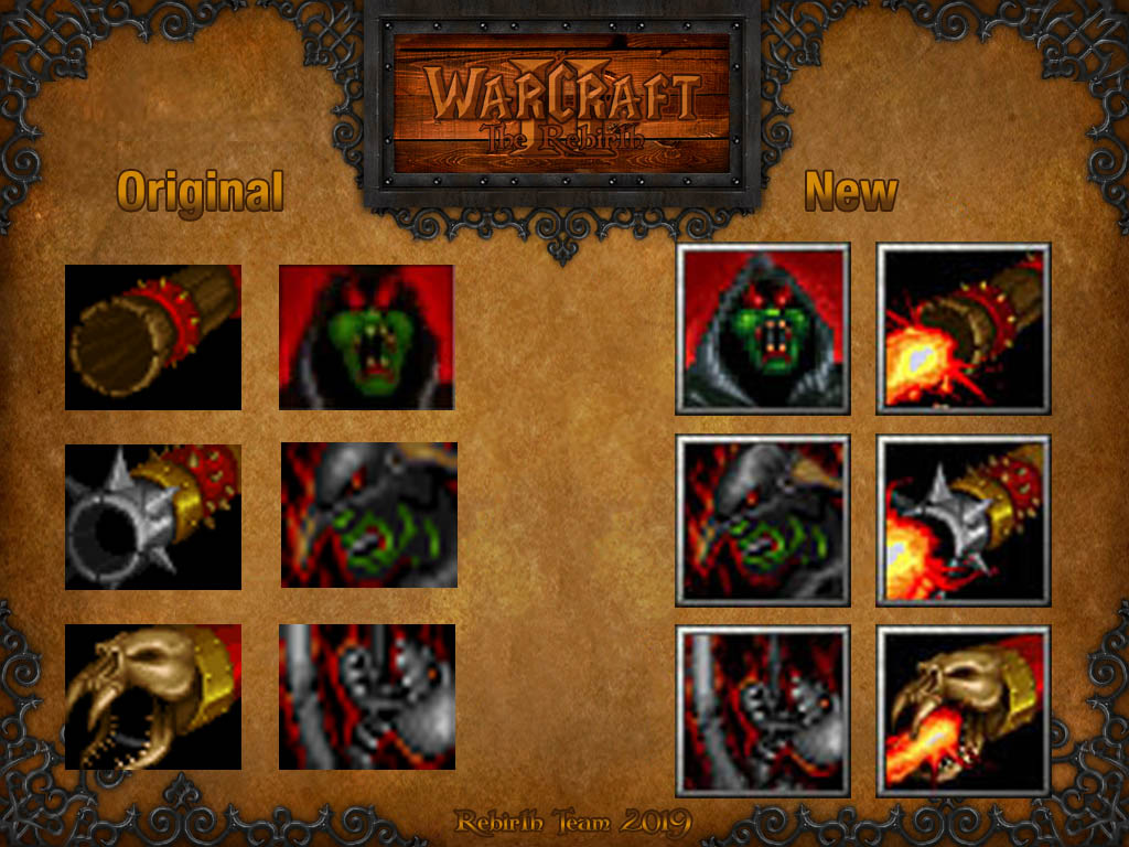
These are adapted icons from the beta version of the Warcraft 2 Tides of Darkness.
The original size 38x46 increased to 64x64.
Versions with cannons fire does not exist in original game.
Keywords:
WCII, Wc II, Warcraft 2, Warcraft 1, Tides of Darkness, Orc
The original size 38x46 increased to 64x64.
Versions with cannons fire does not exist in original game.
Keywords:
WCII, Wc II, Warcraft 2, Warcraft 1, Tides of Darkness, Orc
Previews