This has potential to turn out pretty good if you spend a few more hours on it. I must say, it's a vast improvement from your previous skin, good job.
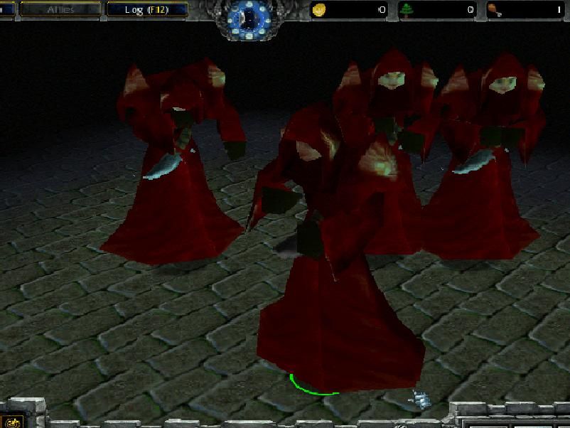
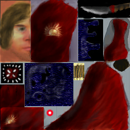
First of all, the face looks rather horrid in game, it doesn't fit in and it's blurry. You should make it darker (because of the hood) and define it more, by using darker lines like on the original. Try to keep the human look though (the colours you've used are fine for the most part, you just need them to be darker where the hood makes a shadow). I can't really tell from the preview how the hair looks on the portrait, but I'm not sure it's such a good idea, and either way, it needs more definition and shading. Right now it's a block of yellow.
As for the robe, you've got a decent idea going. The texture and folds is more or less prepared, you just need to enhance the shading. You should use a hard brush (3px or 1px would be good) with medium opacity and a dark (slightly green) colour to make the shadows in the cape darker. Then use the same brush with a brighter (slightly orange or yellow) colour to make the highlights. You could also try to give the cape as a whole a general shading based on how the body looks in-game.
I can't really judge the symbol, because it's not clearly visible in the preview and I can't be bothered downloading your skin, but I think it could use some work to make it stand out more. For instance, you could make a thin (1px), dark line around it. The dagger could use more work as well, it's too blurry. Use smaller, hard brushes to achieve a clearer look. Highlights on metal are very sudden and bright (shiny, in other words).
 Approved
 !
!


