• Listen to a special audio message from Bill Roper to the Hive Workshop community (Bill is a former Vice President of Blizzard Entertainment, Producer, Designer, Musician, Voice Actor) 🔗Click here to hear his message!
  • Read Evilhog's interview with Gregory Alper, the original composer of the music for WarCraft: Orcs & Humans 🔗Click here to read the full interview.

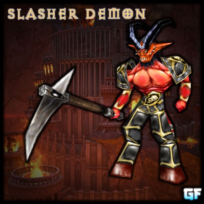
Slasher Demon

The horned slasher demons are the basic heavy soldiers and footmen of the demonic legions. They are equipped with a deadly hellforge-steel scythe to chop and slash through enemies. Their armour might not be the toughest but it is extremely handy and light and permits these demons to run at an astonishing speed and agility.

Mesh made from scratch in Milkshape3D. Animations taken from the satyr model but assigned to the model correctly and added a dissipate animation.
The models was weighted to light for the 'colossus' model contest No.15, so I decided to polish it up and upload it.

Special thanks to HappyTauren whose model of a demon inspired me to try myself doing a Scratch mesh in MS3D the first time.

Credits
Give credits if you use it in your campaign/map, DON'T distribute to other sites and DON'T edit without my permission.
Have fun with the model.
model version.
v 1.0: [15th Dec 2009] Base version
v 1.01: [17th Dec 2009] Realigned some bones
Keywords:
Demon, Slsher, Red, Devil, scythe, Hell, forge, Hellforge, Diablo, Tail, Black, Horns
Contents

Slasher Demon (Model)

Slasher Demon (Model)

Reviews
18:38, 16th Dec 2009 DonDustin: nice model which could be very useful for every demon race/map.

Moderator

M

Moderator

18:38, 16th Dec 2009
DonDustin: nice model which could be very useful for every demon race/map.
 
Level 16
Joined
May 1, 2008
Messages
1,605
Rating of: Slasher Demon

Seas =)

Again a model make by General Frank [ one of the best modeler I ever saw ] and here comes the:


+ Works ingame [as always]
+ Look great [as always]
+ Weapon matches the model to 100%
+ Awesome skin - awesome model [as always]

* Skin and head color are some different - but you don't really note this ingame.

[ + = good / * = neutral / - = bad ]

Please note: What I say here in the rating, is nothing against you or your work. This my personal opinion about this model!
 
Level 26
Joined
Apr 13, 2008
Messages
2,050
.... in every single animation.... except for the stand 1 and spell animations, the demon's chest stretches away from his body and flattens, so it looks like he is almost cut in half, or that his stomach has been crushed somehow.... at any rate, its an overall good looking model in general, very useful, but ingame animations always have problems. other than the annoying, paper-crumpling stomach, i would say this is a 4 or 5 out of 5 model.

attachment.php
 

Attachments

  • GF demon stretch.png
    GF demon stretch.png
    446.1 KB · Views: 11,583
Level 26
Joined
Apr 13, 2008
Messages
2,050
That is a good point will, magos is buggy and can do some weird ass shit sometimes. But i tested it ingame now, and sadly it still stretches, however given the distance and odd angle of the wc3 camera angle, some animations are less noticeable......
You could fix that though with a few keyframes to recenter it. and then it would be a totally awesome model..... like... jazz hands awesome status
152290-albums916-picture21534.png
 
Last edited:
Level 3
Joined
Dec 15, 2009
Messages
40
Great model as always. You dont really notice the color difference in-game. I tested it, and his chest stretches a little. You should make a new race and this model should be a footman type unit. The axe ( or is it a scyte? ) looks a little weird. Gz for all of your awesome 99 models :D
 
Level 12
Joined
Oct 16, 2008
Messages
516
So this is Horny's little bro right?
I think he looks "like an harvester" because the scythe doesnt look curved enough, or dark enough... aggressive enough put short.
Other than that, great idea. Any chance you'll make the actual reaper some day?

EDIT: Oh also, after taking a closer look, the spike in the back of the scythe, combined with the small curving make it look like a wc3 worker's gold mining pickaxe ya know. Look for urself, i bet it's much better without that spike.
EDIT: Nvm that, he's from diablo 3, so u're just sticking to the original. For all the good and the bad it involves lol.
 
Last edited:
Level 3
Joined
Dec 15, 2009
Messages
40
So this is Horny's little bro right?
I think he looks "like an harvester" because the scythe doesnt look curved enough, or dark enough... aggressive enough put short.
Other than that, great idea. Any chance you'll make the actual reaper some day?

EDIT: Oh also, after taking a closer look, the spike in the back of the scythe, combined with the small curving make it look like a wc3 worker's gold mining pickaxe ya know. Look for urself, i bet it's much better without that spike.

I dont agree. The spike make it look demonic XD
 
Thank god somebody made a good version of this, when I started my ver I lost inspiration because it was boring :) However frank, I think it's got a huge potential as a harvester, it'd be awesome if you'd make it more a "basic" unit and turn it into harvester (as a separate version). Oh, and I like the background pic :D HOMM V

Thanks. Well, I was think of doing something like the Imp from MOMM V as a harvester.
 
Level 1
Joined
Jul 21, 2008
Messages
2
EEEEEEEEEEEEEHHHHHHHHHHHAAAAAAAAAAAAAAA!
Dungeon Keper xD I love this game, it's a good idea to create smth like that in W3 Map Editor ?? xDD
 
Level 8
Joined
Nov 29, 2008
Messages
462
A really great model, General_Frank.

It fits perfect into my map. I will use it and ofc give credits to your great work.

The Legions of Hell got new soldiers!
 
Level 11
Joined
Feb 4, 2023
Messages
636
It's a really cool model! Very erratic which suits what you appear to be going for. As @Elfsilver Lord pointed out in the comments, it could also be doubled as a worker mining for gold (doesn't even have to be a lumber boy at the same time, considering it has a pickaxe and not a traditional axe. A similar situation to the acolyte and ghoul implementation for the undead in terms of approach for anims)
A few things hold this model back that really throw me off would be:
1. It appears that he attacks with his arm that doesn't have a weapon in it. Referring to the inspiration you use, I can see why it is that way, it's just a bit disproportionate to what I feel like you're going for. Just feels a bit unsatisfying in that way.
2. The upper lip during the Portrait talk sinks into his face as he talks, which feels a bit unnatural for its facial structure and how mouths move in general.
3. His weapon clips through his torso in the Stand 4 animation.
4. The Stand - 2 animation doesn't feel fluid. Specifically, his head hits a point, then stops a bit jarringly and does similarly to the next point. When it returns back to the start, it feels a bit "programmed" and less fluid and natural. A similar critique to the third standing animation. His left (our right) arm could also do a bit more to be flatter on the ground to appear more like he's stabilizing his weight and his weapon could be tilted sideways to lay out on the ground, rather than through it.

The overall implementation is pretty cool though. Especially his scowling face. Looks like he's always judging you for not being as depraved as he is.
It's really well done!
This model is 15+ years old, give that come consideration.
 
Top