Approved


- Joined
- Jul 20, 2011
- Messages
- 1,279
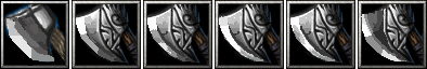
Idea: Never enough axes, but there's already quite a bit. 4/5
Overall Look: looks alright, also 4/5
Detail Quality: I think this is the department that requires the most attention. the wood requires a bit more lighting and the detail on the iron is pretty good but the borders are quite thick, and some of the blending on the cheek require better blending. 3/5
Background Quality: Though a background is not necessary, if you are going to go with one i think you should commit into making it an aesthetic addition that adds to the overall quality of the icon. I think the background lacks intensity and its crudely defined and needs more work. 2/5
Total: 3/5
Thank you for sharing this resource. I might be able to use it in one of my future projects. I would love to see you refine it a bit more.


")