- Joined
- Jul 25, 2009
- Messages
- 3,091
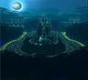
this is going to be my final theme.
I built on my previous concept for this one, so technically it's not an entirely new concept
That's awful bad ass for trolls?
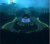
this is going to be my final theme.
I built on my previous concept for this one, so technically it's not an entirely new concept


Be it my shitty resolution on this laptop or the glow from the mantelpiece kerosene lamp that I keep lit for artsy reasons, but it looks like you applied some sort of color filter. Like the sophia effect or something.
And really, harpies? It's Durotar alright (no second guessing there) and you wouldn't have forced a frown from me if you went with, say orcs, trolls or even quilboars actually given a bit of margin for imagination. But I would have to give this a full cavity search to glean any piece that ties in with a harpy concept, and it'll probably be covered in bile and tissue fluid.

Moved the moon and added a glow. It really looks kinda better now.
Also added some trees in the background.
Any more suggestions?

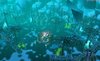
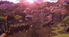
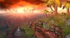
Here is the third Wip from me.
I wanted ogre race, but the Lookout towers are kinda orc/troll like :S
How do you like the rocks?
I need suggestions how to make it more Ogre like.
Examples
Just tick the "Editor: Ignore Model Clicks" box in the object editor for the doodads that you don't want selectable.after i put in clouds and fog effects (i cant click the doodads, always the big effect is selected)


In my opinion the lightrays coming out of the doors are way too bright.
Also there probably are better camera-angles, you should check that possibility.


And here is my Entry for now:
If nothing else is submitted, this is my Final Entry for the contest.
------------------------------------------------------------------------
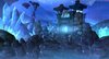
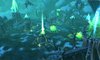
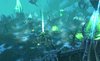
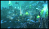
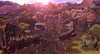
Plague Cult Settlement :

------------------------------------------------------------------------
Credits:
SantoRayo[iP] -> Puddle model
Fingolfin -> Leech model
JetFangInferno -> Posion Stream model
Callahan -> Radioactive Cloud model
Special Thanks to Pharaoh_ for being helpful and awesome.
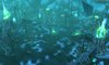
I liked it way better without the snow actually.
The fog can take care of that all by itself.The snow helps fog the image and decrease visibility of all the things that make Blizzard models suck.
The fog can take care of that all by itself.
Region weather effects are some of the worst features in the editor. Far worse than any of the textures. The idea of it is pleasant enough, sure, I can vouch for that. But this doesn't tie in with the fog at all. It looks like someone went apeshit with a 2-hole paper punch.
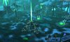
This is really close to my final entry.
I changed the fog form heavy yellow, added clouds+lightning work.
I'll place more ogres later
Thanks for pointing it out, you are exactly right. Ill replace the torchesNice lighting, but the torches look unnatural in the day.
I don't get why people vote for a theme and then don't participate. It really makes me angry and then I have to make something I don't like, hmpf.
New entry.
WIP1
Another entry, maybe my final one if someone doesn't have any good suggestions on how to improve it, I think I'm done.