Community
Maps
Tutorials
Gallery
Support Us
Install the app
-
🏆 Texturing Contest #33 is OPEN! Contestants must re-texture a SD unit model found in-game (Warcraft 3 Classic), recreating the unit into a peaceful NPC version. 🔗Click here to enter!
-
It's time for the first HD Modeling Contest of 2024. Join the theme discussion for Hive's HD Modeling Contest #6! Click here to post your idea!
You are using an out of date browser. It may not display this or other websites correctly.
You should upgrade or use an alternative browser.
You should upgrade or use an alternative browser.
Terraining Contest #11 - Battlefields
- Status
- Not open for further replies.


- Joined
- Oct 31, 2010
- Messages
- 1,057
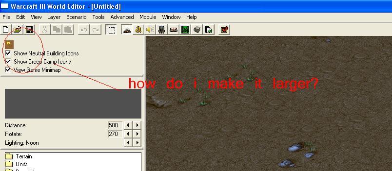
how do i make that minimap larger? it's so small,it's pissing me off
-----------------------
-----------------------
no problem and thanks!Tamerleine said:problem solved!!!
thanks darkzxx! have some rep!
Attachments
- Joined
- Oct 14, 2006
- Messages
- 4,162


- Joined
- Aug 31, 2005
- Messages
- 254
Can anyone explain why clicking on a cloudsphere crashes my WE? Thankfully i had my map saved tho...
Cause it's too large. WE doesn't like large stuff. Increasing the map size helps to some extent.
If you already placed it and you want to modify it, you can place a tiny cloudsphere, select it and then use Edit-> Select all special. It should select the large cloud sphere without crashing the map.
- Joined
- Jan 17, 2010
- Messages
- 6,110

 - Second Place")


Cool entries so far, really good job guys!
- Joined
- Jul 18, 2008
- Messages
- 4,863

Ding dong, another update.
Does the observatory look good?
Is that supposed to be Optimus prime?
- Joined
- Oct 14, 2006
- Messages
- 4,162
Yeap, Optimus Prime. But it's a pity I cant make the doodad go "/".
- Joined
- Mar 12, 2010
- Messages
- 137

Ding dong, another update.
Does the observatory look good?
The glass is angled a bit weird, but it's just a background prop so I don't think anybody will notice or care for a detail that minor.
It looks epic and very nice idea. IMO optimus prime doesn't fit the rest of the terrain at all and sticks out like a sore thumb *something between the bright colors with the otherwise grey modernish color scheme and the way his stance is so unnatural (with the sword angled horizontally and all)) but that's just my opinion.
- Joined
- Oct 14, 2006
- Messages
- 4,162
Yeap, I'm too not satisfied with Optimus Prime, so I'm going to replace him with something, something cool. ")
fladdermasken
Off-Topic Moderator
- Joined
- Dec 27, 2006
- Messages
- 3,688


I actually made it in time. Let's see how much my entry is worth in the end.
I'll make up a story... let's se...
<Insert Cool Name Here>
As the human race laid waste to the world with immense greed
in their neverending quest for resources, they would stumble
upon a secret long since forgotten.
Here we see a human digging expedition, desperately struggling
against insufficient access of resources. Completely unnprepared,
the men now face the planet earth's ancient 'immune system' guardians.
Powered by an ancient script, programmed by a race now forgotten,
these killer machines are designed to annihilate the cause for the planet's mishap.
A battle is inevitable.
Attachments
Last edited:
- Joined
- Oct 14, 2006
- Messages
- 4,162
It's nice and it looks cartoony, but fladdermasken I don't see where a battlefield is suppose to be. Mind pointing out? I'm also surprised you didn't use reflection in the water, or will you? hmm.
Also an update, replaced the Optimus Prime with this GIANTZSSZ TREEZZZ@#!!!!
Which one is better?
I'm also surprised you didn't use reflection in the water, or will you? hmm. Also an update, replaced the Optimus Prime with this GIANTZSSZ TREEZZZ@#!!!!
Which one is better?
Attachments
- Joined
- Jun 2, 2009
- Messages
- 2,002

It's nice and it looks cartoony, but fladdermasken I don't see where a battlefield is suppose to be. Mind pointing out?
Also an update, replaced the Optimus Prime with this GIANTZSSZ TREEZZZ@#!!!!
Which one is better?
Industry vs Nature battle perhaps? And nature is losing?
- Joined
- Mar 12, 2010
- Messages
- 137

- Joined
- Oct 14, 2006
- Messages
- 4,162
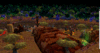
Sir_Elendor, you shouldn't spam those rocks for the background, expand the map and add smooth hills, 3-4 layers. Also lower that big mountain, it looks kind of ugly, sorry.
Another Update, I'm fired up baby!
Added the Nature role to the left side. Wondering what should I do for the right side, suggestions anyone?
Another Update, I'm fired up baby!
Added the Nature role to the left side. Wondering what should I do for the right side, suggestions anyone?
Attachments
- Joined
- Sep 1, 2008
- Messages
- 493
Added the Nature role to the left side. Wondering what should I do for the right side, suggestions anyone?
That looks so awesome.
As I said in the previous thread, I am in. And here is my first wip.

I'm open for suggestion, and this is my third terrain.
- Joined
- Mar 12, 2010
- Messages
- 137
ok guys i got a real problem..
what can i do if my WE says that the doodad limit is reached..
i cant save my map until is remove some of my doodads is there a way how not to get doodad blocked?
what can i do if my WE says that the doodad limit is reached..
i cant save my map until is remove some of my doodads is there a way how not to get doodad blocked?
- Joined
- Oct 14, 2006
- Messages
- 4,162
Sir_Elendor, I don't see how you reached over 8000 doodads, I have around 3000 in mine. Well get the JNPG tool, download it here http://www.hiveworkshop.com/forums/pastebin.php?id=qw5ch1
Copy the files from 0.A.2.B.jasshelper to jassnewgenpack5d and then start the editor inside the jassnewgenpack folder and your ready to terrain.
Goolygot, it looks nice but make those rocks bigger.
Copy the files from 0.A.2.B.jasshelper to jassnewgenpack5d and then start the editor inside the jassnewgenpack folder and your ready to terrain.
Goolygot, it looks nice but make those rocks bigger.
fladdermasken
Off-Topic Moderator
- Joined
- Dec 27, 2006
- Messages
- 3,688
You are correct sir. I will define it more properly for my final entry.Industry vs Nature battle perhaps? And nature is losing?
I have not yet decided how I will polish itI'm also surprised you didn't use reflection in the water, or will you? hmm.
- Joined
- Jul 27, 2008
- Messages
- 14,361


- Joined
- Mar 12, 2010
- Messages
- 137
- Joined
- Aug 23, 2010
- Messages
- 663
i decide to follow this contest.sign me in but i will start make the terrain next monday.
but i will start make the terrain next monday.- Joined
- Jun 2, 2009
- Messages
- 2,002
Looks quite messy, and doodad spammed.
@goolygot
Great idea but a drawback will most certainly be that the textures on those doodads in the foreground will look really bad b/c the screen is so close to them. Also i think you should completely cover those hills in the background with rocks OR remove the hills completely and just make mountains out of the rocks by using the raise tool.
Also the stuff in the foreground is wayyyyyyyyy too bright and colorful to match the stuff in the background.
@fladdermasken
The sky and background (on the finished side) look incredible. The only thing I don't like is the spammed trees on the side, give them some more height variation and maybe add a non-tree feature there to break them up a bit and give some variation.
The foreground is really what needs work. The fences look terrible when they're standing alone like that and the grave is too bright to fit the color scheme well. I also think you should make the mushrooms smaller and darken them slightly. You really should avoid the use of terrain textures if it can be helped, make the ground in the foreground out of rocks instead of using the raise tool and then flattening.
Make you'r foreground as good as you'r background and you'll be doing well. I don't really know how you're going to fit this into the theme however.
@Sir_elendor
- Lower that mountain in the background, it looks unnatural
- Remove all those rocks lining the back of the mountain. Instead find some good terrain rocks with high-res textures and try and create some natural looking rock faces and outcrops.
- You should look at Void's sunset sky (I think it's called advanced lighting) tutorial to give an idea on how to use fog and light to make you'r terrain look better.
- Add more trees to the right and left, they shouldn't be that spaced out. Also make more variations in their size (slight, but more).
- Definitely work on the stuff on the mountain itself. Most of the doodads you've used are so small one can't even tell what they are. It also seems so chaotic and random, choose an idea for one area and then use an array of different doodads to make that one idea come to life. All doodads should work towards the benefit of an over-arching idea or concept, not just stand on their own.
- I don't know what that yellowish cylinder-looking thing is but you should definitely remove it.
![T11WiP2[1].gif](https://www.hiveworkshop.com/data/attachments/70/70284-06a26fc825023c28a3f9d2064532b455.jpg "T11WiP2[1].gif")
You'r idea has potential, the two sides, the river dividing, the long-view, you should definitely keep working on it.
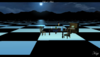
@VeljkoM
- The angle reveals that the weather effects are created at a certain height and makes it look very unrealistic. Observe:
![Clip[1].png](https://www.hiveworkshop.com/data/attachments/70/70285-53a9222e4ecd89d31662276b3f8f080b.jpg "Clip[1].png")
- The city looks great so far, but I think it would look alot better if you added more buildings (like 3 times as many as you do now) and also make some very large ones way in the background to give off the idea that this truly is a big city. Right now everythings in the foreground and it looks small.
- Add more detail to the city walls (ivy and vines from the UTM would look good)
- Work on the sky, definitely add some sort of sun.
- Fill the hill on the left alot better. Add more trees and maybe some rock faces and such.
@Oziris
This is going to be a close poll for 1st I can already tell ^-^
On the one hand the tree-collosus guy looks much better than optimus prime, on the other hand I hate you because I have tree-ents in mine and now i'm pry going to have to remove them.
It's very unclear what the purple diamond thing in the middle is. Is it the tree-collosi's fist or is it like an explosion of energy occuring when their two fists collided?
Also the rift on the bottom is way too dark, it's very hard to tell what you were going for there. I would reccomend putting some carefully placed sfx effects down there to color it up.
I also don't like how you've stacked the trees on the left. You need to completely cover the hill with trees OR add more detail to the hill itself so it doesn't look so bad when you see the spaces between the trees. The main problem here is that none of you'r trees are angled so they all look un-natural.
I'm a little worried about what you'r final submission is going to be if your WIP looks this good and you still have over a month to work on it. But seriously, bring it
@Keiji
Epic idea, love the goblin theme. Can't wait to see more WIP pics.
Can't say i'm a big fan of those platforms on the forsaken side. Not only do they not match the quality of the rest of the terrain, but it also doesn't make much sense for there to be these perfectly build platforms in the middle of a forest. Usually trench warfare would consist of hastily-made blockades and such.
Great idea but a drawback will most certainly be that the textures on those doodads in the foreground will look really bad b/c the screen is so close to them. Also i think you should completely cover those hills in the background with rocks OR remove the hills completely and just make mountains out of the rocks by using the raise tool.
Also the stuff in the foreground is wayyyyyyyyy too bright and colorful to match the stuff in the background.
@fladdermasken
The sky and background (on the finished side) look incredible. The only thing I don't like is the spammed trees on the side, give them some more height variation and maybe add a non-tree feature there to break them up a bit and give some variation.
The foreground is really what needs work. The fences look terrible when they're standing alone like that and the grave is too bright to fit the color scheme well. I also think you should make the mushrooms smaller and darken them slightly. You really should avoid the use of terrain textures if it can be helped, make the ground in the foreground out of rocks instead of using the raise tool and then flattening.
Make you'r foreground as good as you'r background and you'll be doing well. I don't really know how you're going to fit this into the theme however.
@Sir_elendor
- Lower that mountain in the background, it looks unnatural
- Remove all those rocks lining the back of the mountain. Instead find some good terrain rocks with high-res textures and try and create some natural looking rock faces and outcrops.
- You should look at Void's sunset sky (I think it's called advanced lighting) tutorial to give an idea on how to use fog and light to make you'r terrain look better.
- Add more trees to the right and left, they shouldn't be that spaced out. Also make more variations in their size (slight, but more).
- Definitely work on the stuff on the mountain itself. Most of the doodads you've used are so small one can't even tell what they are. It also seems so chaotic and random, choose an idea for one area and then use an array of different doodads to make that one idea come to life. All doodads should work towards the benefit of an over-arching idea or concept, not just stand on their own.
- I don't know what that yellowish cylinder-looking thing is but you should definitely remove it.
You'r idea has potential, the two sides, the river dividing, the long-view, you should definitely keep working on it.
@VeljkoM
- The angle reveals that the weather effects are created at a certain height and makes it look very unrealistic. Observe:
- The city looks great so far, but I think it would look alot better if you added more buildings (like 3 times as many as you do now) and also make some very large ones way in the background to give off the idea that this truly is a big city. Right now everythings in the foreground and it looks small.
- Add more detail to the city walls (ivy and vines from the UTM would look good)
- Work on the sky, definitely add some sort of sun.
- Fill the hill on the left alot better. Add more trees and maybe some rock faces and such.
@Oziris
This is going to be a close poll for 1st I can already tell ^-^
On the one hand the tree-collosus guy looks much better than optimus prime, on the other hand I hate you because I have tree-ents in mine and now i'm pry going to have to remove them.
It's very unclear what the purple diamond thing in the middle is. Is it the tree-collosi's fist or is it like an explosion of energy occuring when their two fists collided?
Also the rift on the bottom is way too dark, it's very hard to tell what you were going for there. I would reccomend putting some carefully placed sfx effects down there to color it up.
I also don't like how you've stacked the trees on the left. You need to completely cover the hill with trees OR add more detail to the hill itself so it doesn't look so bad when you see the spaces between the trees. The main problem here is that none of you'r trees are angled so they all look un-natural.
I'm a little worried about what you'r final submission is going to be if your WIP looks this good and you still have over a month to work on it. But seriously, bring it
@Keiji
Epic idea, love the goblin theme. Can't wait to see more WIP pics.
Can't say i'm a big fan of those platforms on the forsaken side. Not only do they not match the quality of the rest of the terrain, but it also doesn't make much sense for there to be these perfectly build platforms in the middle of a forest. Usually trench warfare would consist of hastily-made blockades and such.
fladdermasken
Off-Topic Moderator
- Joined
- Dec 27, 2006
- Messages
- 3,688
Thank you for the feedback. The trees do have height variation, although larger variation on distant trees would only look messed up. So the variation is slight. I do, however, agree on the fact that they are spammed.@fladdermaskenThe sky and background (on the finished side) look incredible. The only thing I don't like is the spammed trees on the side, give them some more height variation and maybe add a non-tree feature there to break them up a bit and give some variation.
The foreground is really what needs work. The fences look terrible when they're standing alone like that and the grave is too bright to fit the color scheme well. I also think you should make the mushrooms smaller and darken them slightly. You really should avoid the use of terrain textures if it can be helped, make the ground in the foreground out of rocks instead of using the raise tool and then flattening.
Make you'r foreground as good as you'r background and you'll be doing well. I don't really know how you're going to fit this into the theme however.
As previously mentioned, the foreground will be updated heavily. I'm not sure I agree on the fence, however the grave won't be in the final entry. It simply slipped my mind to remove it.
I'm not sure I do agree on the textures either, even though my tile work so far is terrible. I've seen a vast ammount of terrains looking legendary due to the fact that they used tiles in very effective means.
As for the theme, it is as previously stated, a battle of supremacy between nature and technology. I will clarify this before I release my final entry.
- Joined
- Dec 8, 2009
- Messages
- 654
After much time of thinking and looking at WIPs, I found out what I should do: A giant chessboard. =D
fladdermasken
Off-Topic Moderator
- Joined
- Dec 27, 2006
- Messages
- 3,688
Keiji did one of those, perhaps it could be an inspiration:After much time of thinking and looking at WIPs, I found out what I should do: A giant chessboard. =D
- Joined
- Dec 8, 2009
- Messages
- 654
Keiji did one of those, perhaps it could be an inspiration:
Im thinking more along the lines of traditional chess, with those chess pieces, but with them looking as if they are really fighting a war, not like they are not doing crap.
- Joined
- Aug 23, 2010
- Messages
- 663
WIP:

i'm going to add tile variation,light environment,little edit and unit next monday.
i'm going to add tile variation,light environment,little edit and unit next monday.
Last edited:
- Joined
- Mar 16, 2010
- Messages
- 266
Error trigger, your WIP didn't show
- Joined
- Aug 23, 2010
- Messages
- 663
okay edited.
- Joined
- Oct 14, 2006
- Messages
- 4,162
Error_trigger, it still doesn't show!
- Joined
- Apr 18, 2008
- Messages
- 8,421


Oziris, he said it's in his album.
- Joined
- Oct 14, 2006
- Messages
- 4,162
Oh, pardon me for not reading carefully. Anyway, better post the terrain here, some people are lazy to go to your album and see it.
- Joined
- Mar 16, 2010
- Messages
- 266
I want to participate aswell =D just for fun, though... (i know all of your terrains are insane and i'm just a beginner at terraining) but hey, it's worth a shot xD
same here,I'm also not good at terraining...
I only participated just for the experienced
- Joined
- Aug 23, 2010
- Messages
- 663
so,guys have you seen my WIP?
- Joined
- Oct 14, 2006
- Messages
- 4,162
Error_trigger, it looks flat and you need mountains in the background, now it feels like the end of the world is behind that city.
- Joined
- Aug 23, 2010
- Messages
- 663
Oziris,it's a WIP,but okay.
- Joined
- Oct 14, 2006
- Messages
- 4,162
I know it is but is it better if I gave you suggestions or just say "Yeah, I've seen your terrain" ?

- Status
- Not open for further replies.
Similar threads
- Replies
- 416
- Views
- 43K
- Replies
- 387
- Views
- 28K
- Replies
- 699
- Views
- 55K
- Replies
- 483
- Views
- 52K