
 Approved
Moderator
M
Moderator
19:31, 5th Jun 2011
shiiK: I'll open this review by citing my previous comment on this skin.
Especially take note of the latter two sentences. Please use the Texturing & Surfacing board to post your skins in for now. Read some tutorials as well. It will help you become a much better artist. Furthermore, never make a new upload for a skin that has already been uploaded, use the Update button on your first upload to update it. If it has been permanently rejected, contact the moderator that rejected it (in this case, that's me) and request that it is opened - preferably with a preview of the updated skin.
I admit this is better than the previous version, though, and a lot of the blurriness is gone. However, there's still a lot more work to do. I'm also curious about the hair, why is it solid grey and why is there a drawing of a hole on it?
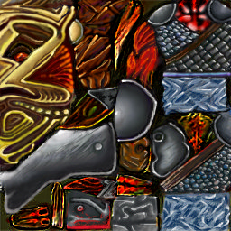
shiiK: I'll open this review by citing my previous comment on this skin.
This is amazingly inconsistent. There's so much going on here, I don't know where to start. You need to stick to fewer materials. There's complete absence of shading, which makes it look like the skin wasn't meant for the model. Check out some tutorials, post any coming work of yours in the Texturing & Surfacing board for guidance. You're not ready to upload skins yet.
Especially take note of the latter two sentences. Please use the Texturing & Surfacing board to post your skins in for now. Read some tutorials as well. It will help you become a much better artist. Furthermore, never make a new upload for a skin that has already been uploaded, use the Update button on your first upload to update it. If it has been permanently rejected, contact the moderator that rejected it (in this case, that's me) and request that it is opened - preferably with a preview of the updated skin.
I admit this is better than the previous version, though, and a lot of the blurriness is gone. However, there's still a lot more work to do. I'm also curious about the hair, why is it solid grey and why is there a drawing of a hole on it?


