
 Approved
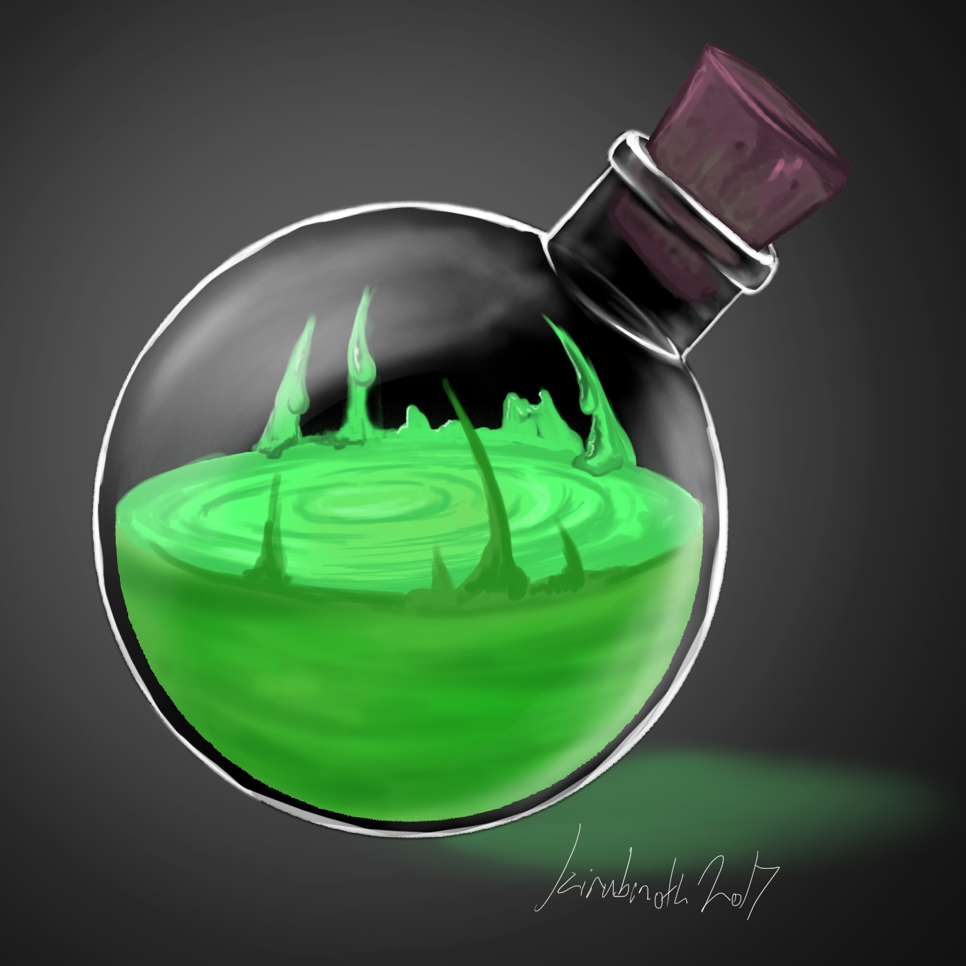


- Joined
- Jun 2, 2008
- Messages
- 11,369

Try not to use that gray backgrounds anymore, it throws off the quality of the overall icon when finished. The green go inside the bottle, i don't like those parts that are coming upwards, they look really weird. I would maybe add bubbles coming from the goo instead of those lines coming up.


