- Joined
- Jan 30, 2009
- Messages
- 2,273


Hello Future Icon artists!
In this tutorial we will learn the basics of icon art and all about the art tool GIMP (Gnu Image Manipulation Program) This tutorial MAY be used for photoshop as well but take note that the toolbox may not be in the same order.
Tools You Will Need
- GIMP 2.6.6 (Any other image editing tool will work. (PREFERABLY NOT PAINT))
- Shadow_Deamon's Button Manager Tool
1:Getting to Know Your Toolbox
2:Creating Your First Icon
3:Finalizing
1:Getting to Know Your Toolbox
Your toolbox is your greatest ally. Get to know it and you can master all types of techniques used to make the perfect icon.Transform Tools

Selection Tools

Brush Tools

Colour Tools

Other Tools

2:Creating Your First Icon
Now that you know your toolbox, you can start making your own icon.STEP 1:
| You Want to start with a basic background. (BG) So i have started with the simplest of all backgrounds, the plain black BG |
STEP 2:
| After that, you want to make sure you have your basic shape. Start a new layer. I like drawing it with solid colours without bothering to do an outline. But if you want to do a basic outline and then fill in your basic colours, you may. |
STEP 3:
| After that, you want to get some basic shape out of the item(s)/object(s) Try out some shading and highlights that work for your icon. Such as; I use scratchy highlights to give it a more worn out texture. Smoother highlights will lead to a smoother object and scratchy highlights will give you a more worn out feeling. Also, be sure to not just put highlights randomly. It is key to have a sense of light coming from some direction. Make sure your highlights follow this path of light. Such as how i have done with putting the highlights along the top of the metal. |
STEP 4:
| Next, you want to add some basic shadows to the object. Try either using the burn tool or a darker version of the base colour. Putting it along the parts that are lower than than some of the higher ones, is very good for the full feel of the icon. Also, that light path we talked about, try doing some of the shadows along the opposite side. |
STEP 5:
| Add some more highlights to the rest of the icon. Once again following the path of light we talked about, to give the icon a whole lot more realism. A good way to do this, is with white at 15% opacity. |
STEP 6:
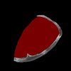
| And finalize the icon by adding a few more highlights and shadows here and there. Give the icon an even better impression of realism. |
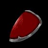
STEP 7:
Size Down to 64 x 64... And you're done!  |
3:Finalizing
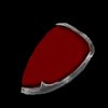
Now that you've constructed your icon,It is time to put borders on the icon and convert it to .blp
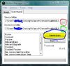
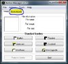
Open up your button manager tool and select the icon wizard.

Once you've selected your Input folder (red)
And your output folder (green)
Choose what Borders you want, and select the Create Icons button (blue)
Make sure the Icon is in a format that the program recognizes (JPG, BMP, TGA, PNG, Bitmap)

your icons should come out in your output folder in .blp format.
Well Done! You've created your first icon!
~Dentothor
Attachments
-
 2.JPG41 KB · Views: 423
 -
 Capture.JPG36.4 KB · Views: 384
 -
![OtherTools[2].jpg](/data/attachments/46/46953-2da80a7c403a692cc998aff82a5cc530.jpg) OtherTools[2].jpg31.2 KB · Views: 312
OtherTools[2].jpg31.2 KB · Views: 312 -
![BrushTools[1].jpg](/data/attachments/46/46954-3f78a2c4e0f42d924fd29f96a141702d.jpg) BrushTools[1].jpg72.2 KB · Views: 335
BrushTools[1].jpg72.2 KB · Views: 335 -
![SelectionTools[1].jpg](/data/attachments/46/46956-ed10bff87248f64b50287414a904cd65.jpg) SelectionTools[1].jpg40.1 KB · Views: 328
SelectionTools[1].jpg40.1 KB · Views: 328 -
![ColourTools[1].jpg](/data/attachments/46/46958-9856ccde9859b1e41c6aed08edfadda5.jpg) ColourTools[1].jpg62 KB · Views: 352
ColourTools[1].jpg62 KB · Views: 352 -
![TransformTools[1].jpg](/data/attachments/46/46959-054efa2fdd35693eb03a847fccee0a1b.jpg) TransformTools[1].jpg44.7 KB · Views: 284
TransformTools[1].jpg44.7 KB · Views: 284 -
 Step1.jpg689 bytes · Views: 4,215
 -
 Step2.jpg9.4 KB · Views: 3,147
 -
 Step3.jpg10.8 KB · Views: 3,097
 -
 Step4.jpg12.3 KB · Views: 3,019
 -
 Step5.jpg14.7 KB · Views: 3,110
 -
 Step6.jpg19.9 KB · Views: 3,107
 -
 Step7.jpg2.5 KB · Views: 2,644
 -
 Step7.png4.5 KB · Views: 3,059
 -
 BTNDemonShoulderUPG1.jpg1.8 KB · Views: 5,352
 -
 DISBTNDemonShoulderUPG1.jpg1.1 KB · Views: 5,377
Last edited:


