For a first attemp i have to say i am really impressed, looks great.
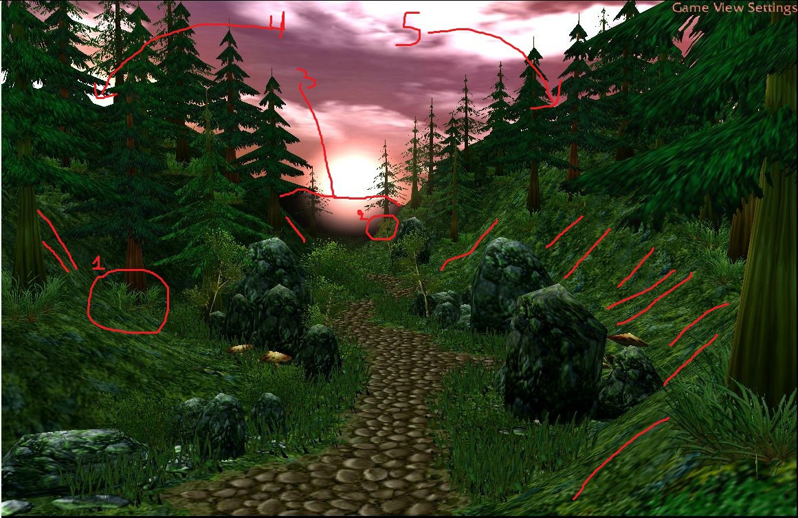
I especially loved the part which you covered the tree bases with plants
(dont know if intetionally or not)
but its good because they look bad, especially on cliffs, so its really good you covered them up.
Now to some things i suggest,
1.) This tree looks kinda bad because of the terrain angle, try smoothing the terrain a bit or lower the tree height with cntrl + pgdown
2.) Same thing, the tree is on a very steep side of the cliff and looks bad because its so straight up and you can see its base being so straight.
3.) Maybe try to add some more trees in the hills in the distance, dark colored so they will look like shadows.
4.) Empty spot, well it just looks bad to my eye, i am a barock kinda type, and i just hate empty spots xD but thats just me.
5.) same as above
Also you can see some red stripes in the terrain, its places where the terrain is too sharp and too steep, which is rather bad, maybe try to smooth it a bit see how it looks.
About the sky, its really great, but you could use some different colors on the clouds, see if it can be made a little more interesting.
You will hear this a lot, "Blizzard rocks are ugly", personally i dont find them ugly, ecxept for the base part where it has some extra rocks on the ground, yeah that part looks awfull, so if you are to use them, make sure to lower them enough to hide that abomination base..!
In general its really good, i really liked it +rep!
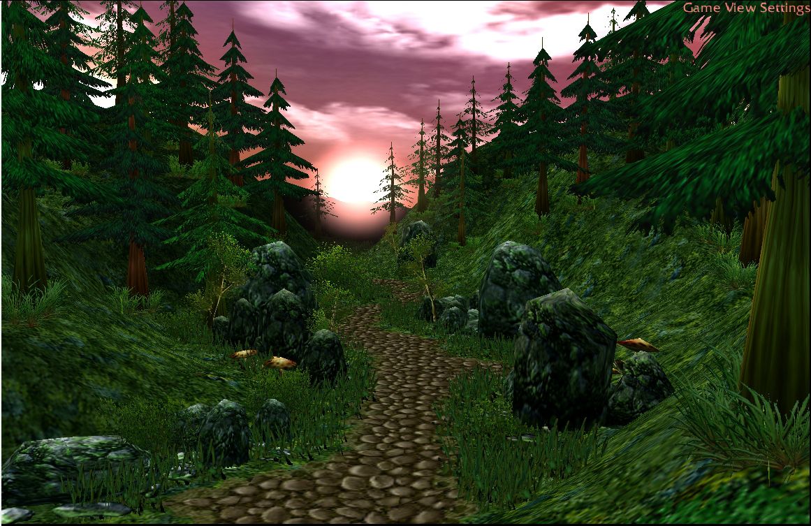
 Hello hive, this is my first post on your site, although I have been a longtime visitor. After starting lots of ambitious projects and never even getting close to finishing them, I decided to try my hand at artistic terraining. This is my first attempt. How did I do? Feedback would be much appreciated. Thanks.