 Approved


- Joined
- Jan 25, 2011
- Messages
- 2,386


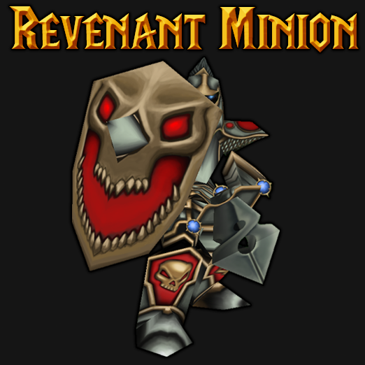
Definitely needs more highlights and shadows. The shield could use more texture as it looks perfectly clean. Metal could be more metal it looks very dull atm and lighting is inconsistent (the lightsource is from the above). But the concept was really cool and I definitely love it as a whole. Color choices could be more solid/vibrant it looks very dead but still acceptable though because of the concept. If you are using photoshop I really recommend to add a color wheel plugin (it is really helpful to me). Oh and really cool sword


