Listen to a special audio message from Bill Roper to the Hive Workshop community (Bill is a former Vice President of Blizzard Entertainment, Producer, Designer, Musician, Voice Actor) 🔗Click here to hear his message!
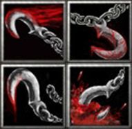
.1 The 3rd icon's blood looks pretty crappy. It looks stretched, spammed, and smudged. I just don't see how it resembles blood.
.2 The chain in the second icon has a pretty cheap looking white outline.
The only icon I really like is the first one. Bringing me to this rating of, 6\10.
.1 The 3rd icon's blood looks pretty crappy. It looks stretched, spammed, and smudged. I just don't see how it resembles blood.
.2 The chain in the second icon has a pretty cheap looking white outline.
The only icon I really like is the first one. Bringing me to this rating of, 5\10.
This site uses cookies to help personalise content, tailor your experience and to keep you logged in if you register.
By continuing to use this site, you are consenting to our use of cookies.


 Approved
