• Listen to a special audio message from Bill Roper to the Hive Workshop community (Bill is a former Vice President of Blizzard Entertainment, Producer, Designer, Musician, Voice Actor) 🔗Click here to hear his message!
  • Read Evilhog's interview with Gregory Alper, the original composer of the music for WarCraft: Orcs & Humans 🔗Click here to read the full interview.

HeroPitlord.blp

This bundle is marked as useful / simple. Simplicity is bliss, low effort and/or may contain minor bugs.
  • Like
Reactions: deepstrasz
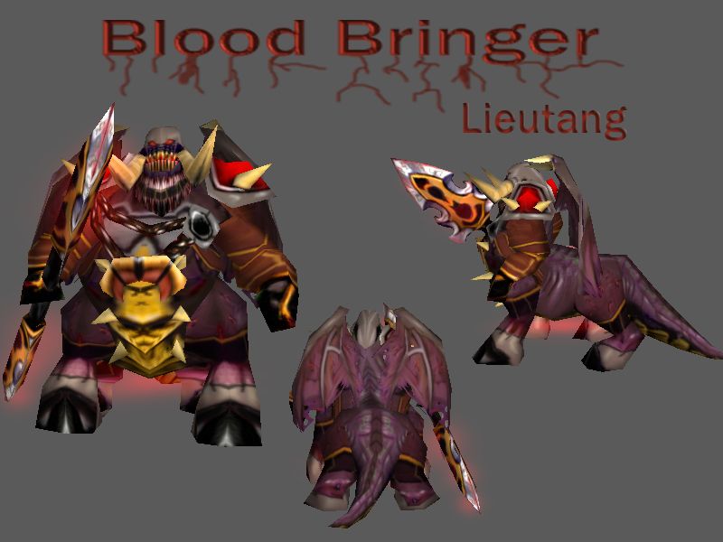
Better form of my Blood Bringer latest skin.
I think, now is this skin OK.
Dont modify it without my permission please.
Please comment, give me credit and enjoy :)

Keywords:
hero, pit, lord, hell, doom, blood, bringer
Contents

Blood Bringer (Texture)

Reviews
11:30, 22nd Mar 2009 Dan van Ohllus: There's more need for freehand in this skin, because the recolored parts are almost taking the majority of the modification. And the freehanded parts need shading and definition. I suggest you take a look at...

Moderator

M

Moderator

11:30, 22nd Mar 2009
Dan van Ohllus:
There's more need for freehand in this skin, because the recolored parts are almost taking the majority of the modification.
And the freehanded parts need shading and definition.

I suggest you take a look at the tutorials at this forum and in other places (wc3c, google, various art sites) so you can learn to improve your texturing knowledges.

I'm going to reject this.
 
Level 10
Joined
Jan 27, 2009
Messages
424
The hands and the face suck. The rest is fine.

I think this is your first skin. Never upload your first skin.

But it isn't really bad. And you should count on comments of more expert people, such as THE_END and other skinners.

EDIT: Oh wait, it's bad. Not for a first skin, but that's really uggly, sorry.
 
Level 3
Joined
Dec 9, 2008
Messages
56
The rest of it is so not perfect lol. The head that is the ugliest part has the most freehand.

The entire skin from what I can see is a low opacity gray brush that's been splattered all over the purple parts of the pitlord. Doesn't even look bloody, good luck with future skins.
 
Level 6
Joined
Oct 26, 2007
Messages
211
the chest armor, shoulder plates, and blade are quite nice (but maybe make the steelish edges of the blades matchthe color scheme)

edit: some stuff that might help improve:

the greysih part at the top of his head looks like a hood (see side-view). but it just doesnt look like it enough (in my opinion) from front-view perspective.maybe if you extend that grey matter more along the chest, the grey part will look like one big metal piece comprising the hood, etc, thus making the hood object apparent.

maybe get rid of the boots. they make him look like a prostitute. switch to hoofs + bracers around his legs maybe; make the bracers match the greyish armor stuff on him, maybe wiyth some runes of the color of his horns and the goldy stuff on his hanging chest plate.
 
Top