
 Approved


- Joined
- Jun 2, 2008
- Messages
- 12,755

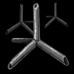
Cool idea, but the shape is just wierd i would just stick with the one "caltrop" in from instead of having 2 in the back. I also would probably zoom in on the caltrop a bit. Lastly, make the 3 ends of the caltrop more sharper looking they seem dull.


