Listen to a special audio message from Bill Roper to the Hive Workshop community (Bill is a former Vice President of Blizzard Entertainment, Producer, Designer, Musician, Voice Actor) 🔗Click here to hear his message!
Blizzard CrashingWave icon is great and I shuld make something else.
So I did. Water Storm icon dont exist at Warcraft. It is like tornado
but with more water colors, diferent shape and some effects.
well, the wave looks alright, but it doesn't fit with the background.
A blue-white wave with a black background doesn't look good.
Maybe add a blueish glow, or a silhouette person in front of it, try different backgrounds,
and look which one looks best.
And if you have more time, you could also make the wave better, but it's not badly necessary.
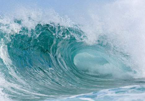
What I'm really concerned with is the top of the wave. The rest is done very well in form and colour, but the top of the wave is too square, and if you would kindly view the pictures of waves Amigurumi posted, you will see that the top is generally white and foamy, whereas yours maintains the same colouration throughout.
Yeah I have to say, this is much more striking. You shouldn't leave blank space though, it tends to make the icon dull. Just add dimmer shades of the same water effect in the places you want to "fade out". Dimmer as in darker and less clear.
Yo man I'm using this icon, as well as a hook spell you made (I altered it a bit to suit my map) in my map Guild Arena: the BattleChasers, and I think it's totaly cewl, so:
+Rep for you
Also I see you have quite an inventory of spells and icon's, I'll be sure to check them out now that I'm back on the Hive again.
Tnx once more
This site uses cookies to help personalise content, tailor your experience and to keep you logged in if you register.
By continuing to use this site, you are consenting to our use of cookies.