• 🏆 Texturing Contest #33 is OPEN! Contestants must re-texture a SD unit model found in-game (Warcraft 3 Classic), recreating the unit into a peaceful NPC version. 🔗Click here to enter!
  • It's time for the first HD Modeling Contest of 2024. Join the theme discussion for Hive's HD Modeling Contest #6! Click here to post your idea!

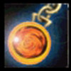
BTNTrinketofHonor

This bundle is marked as useful / simple. Simplicity is bliss, low effort and/or may contain minor bugs.
This is a Trinket of Honor, it's my first icon done with photoshop, next will be better, of course. But It's a beginning.

Keywords:
Trinket, Honor, Lancer, Item, Medallion
Contents

BTNTrinketofHonor (Icon)

Reviews
15:51, 10th Jun 2009 zombie2279: Obvious CnP is obvious. This will stay rejected unless you can come up with a valid explenation how you made this. Feel free to PM me work in progress screenshots and full pictures.

Moderator

M

Moderator

15:51, 10th Jun 2009
zombie2279: Obvious CnP is obvious. This will stay rejected unless you can come up with a valid explenation how you made this.

Feel free to PM me work in progress screenshots and full pictures.
 
Level 9
Joined
Jan 11, 2009
Messages
282
technique ? I just used the normal draw pen to draw the lines etc., then adding the circles which will be the gem and drawing some circes with different colors in there. Then i turned it 3 times and i had my gem. Then adding a little bakcground, make the icon smoother and adding a light effect at the gem. Ready. (Would descrube it more detalied but my english is .. ehm .. shit).
EDIT: And why a 640x640 Pixel image ? this would be hardly look good..

No impossible. if you just used the pen, you couldn't have done this icon. especially on your first try. CnP for Sure. Plus the immage has red and purple dots. leading it to be an immidiate and definate CnP
 
Level 2
Joined
Jun 3, 2009
Messages
15
why do you think so bad of my work ..

Dento is one of those who only sees the bad in people.
You really shouldn't listen to certain people on the Hive. There are many who have nothing better to do than whining.

I think you should fix the glow and it will be a great icon.
 
Level 6
Joined
Nov 16, 2008
Messages
111
im sorry for saying this, but there are a few minor negative things about this icon.
-First, The chains are way too blurry...
-Second, The yellow circle around the orange thing is way too sharpened...
-Third, This is a rip off something stupid, other words CnP!
 
Top